| 年份 | 国家或地区 | 区域划分 | 收入水平 | 人均 GDP | 预期寿命 | 人口总数 |
|---|---|---|---|---|---|---|
| 1991 | 阿鲁巴 | 拉丁美洲与加勒比海地区 | 高收入 | 13494.7 | 73.5 | 64623 |
| 1992 | 阿鲁巴 | 拉丁美洲与加勒比海地区 | 高收入 | 14048.3 | 73.5 | 68240 |
| 1993 | 阿鲁巴 | 拉丁美洲与加勒比海地区 | 高收入 | 14942.3 | 73.6 | 72495 |
| 1994 | 阿鲁巴 | 拉丁美洲与加勒比海地区 | 高收入 | 16241.6 | 73.6 | 76705 |
| 1995 | 阿鲁巴 | 拉丁美洲与加勒比海地区 | 高收入 | 16441.8 | 73.6 | 80324 |
| 1996 | 阿鲁巴 | 拉丁美洲与加勒比海地区 | 高收入 | 16583.0 | 73.6 | 83211 |
6 ggplot2 入门
2006 年 Hans Rosling(汉斯·罗琳)在 TED 做了一场精彩的演讲 — The best stats you’ve ever seen。演讲中展示了一系列生动形象的动画,用数据记录的事实帮助大家理解世界的变化,可谓是动态图形领域的惊世之作。时至今日,已经超过 1500 万人观看,产生了十分广泛的影响。下面从数据源头 — 世界银行获取数据,整理后取名 gapminder。本节将基于 gapminder 数据集介绍 ggplot2 绘图的基础知识,包括图层、标签、刻度、配色、图例、主题、文本、分面、字体、动画和组合等 11 个方面,理解这些有助于绘制和加工各种各样的统计图形,可以覆盖日常所需。gapminder 数据集以数据框的形式存储在 R 软件运行环境中,一共 4950 行,7 列。篇幅所限,下 表格 6.1 展示该数据集的部分内容,表中人均 GDP 和预期寿命两列四舍五入保留一位小数。
在 R 环境中,加载 gapminder 数据集后,可以用 str() 函数查看数据集 gapminder 各个列的数据类型和部分属性值。
#> 'data.frame':    4950 obs. of  7 variables:
#>  $ year        : num  1991 1992 1993 1994 1995 ...
#>  $ country     : chr  "阿鲁巴" "阿鲁巴" "阿鲁巴" "阿鲁巴" ...
#>  $ region      : Factor w/ 7 levels "北美","拉丁美洲与加勒比海地区",..: 2 2 2 2 2 2 2 2 2 2 ...
#>  $ income_level: Ord.factor w/ 4 levels "低收入"<"中低等收入"<..: 4 4 4 4 4 4 4 4 4 4 ...
#>  $ gdpPercap   : num  13495 14048 14942 16242 16442 ...
#>  $ lifeExp     : num  73.5 73.5 73.6 73.6 73.6 ...
#>  $ pop         : num  64623 68240 72495 76705 80324 ...
其中,country(国家或地区)是字符型变量,region (区域)是因子型变量,income_level(收入水平)是有序的因子型变量,year (年份)、 pop (人口总数)、lifeExp (出生时的预期寿命,单位:岁)和 gdpPercap (人均 GDP,单位:美元)是数值型变量。
6.1 图层
ggplot2 绘图必须包含以下三个要素,缺少任何一个,图形都是不完整的。
- 数据,前面已经重点介绍和准备了;
- 映射,数据中的变量与几何元素的对应关系;
- 图层,至少需要一个图层用来渲染观察值。
下面逐一说明三个要素的作用,为简单起见,从数据集 gapminder 中选取 2007 年的数据。
library(ggplot2)
gapminder_2007 <- gapminder[gapminder$year == 2007, ]
ggplot(data = gapminder_2007)
ggplot(data = gapminder_2007, aes(x = gdpPercap, y = lifeExp))
ggplot(data = gapminder_2007, aes(x = gdpPercap, y = lifeExp)) +
  geom_point()
ggplot(data = gapminder_2007, aes(x = gdpPercap, y = lifeExp)) +
  geom_point(aes(size = pop))
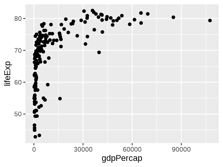
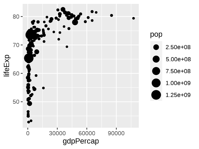
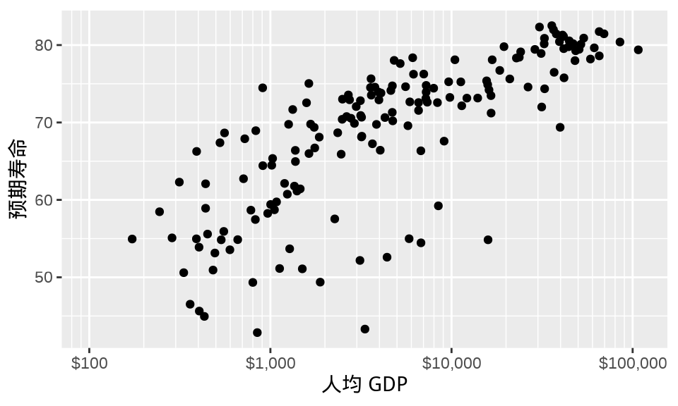
图 6.1 (a) 仅提供数据,只渲染出来一个绘图区域。 图 6.1 (b) 仅提供数据和映射,将变量 gdpPercap 映射给横轴,变量 lifeExp 映射给纵轴,继续渲染出来横、纵坐标轴及标签。 图 6.1 (c) 提供了数据、映射和图层三要素,观察值根据几何图层 geom_point() 将几何元素 「点」渲染在绘图区域上,形成散点图。函数 ggplot() 和函数 geom_point() 之间是以加号 + 连接的。无论最终产出的图形如何复杂,这个模式贯穿 ggplot2 绘图。
10 多年来,ggplot2 包陆续添加了很多几何图层,目前支持的有 53 个,如下:
| geom_abline | geom_dotplot | geom_qq_line |
| geom_area | geom_errorbar | geom_quantile |
| geom_bar | geom_errorbarh | geom_raster |
| geom_bin_2d | geom_freqpoly | geom_rect |
| geom_bin2d | geom_function | geom_ribbon |
| geom_blank | geom_hex | geom_rug |
| geom_boxplot | geom_histogram | geom_segment |
| geom_col | geom_hline | geom_sf |
| geom_contour | geom_jitter | geom_sf_label |
| geom_contour_filled | geom_label | geom_sf_text |
| geom_count | geom_line | geom_smooth |
| geom_crossbar | geom_linerange | geom_spoke |
| geom_curve | geom_map | geom_step |
| geom_density | geom_path | geom_text |
| geom_density_2d | geom_point | geom_tile |
| geom_density_2d_filled | geom_pointrange | geom_violin |
| geom_density2d | geom_polygon | geom_vline |
| geom_density2d_filled | geom_qq |
也正因这些丰富多彩的图层,ggplot2 可以非常便捷地做各种数据探索和展示工作。从时间序列数据、网络社交数据到文本数据、空间数据,乃至时空数据都有它大显身手的地方。
6.2 标签
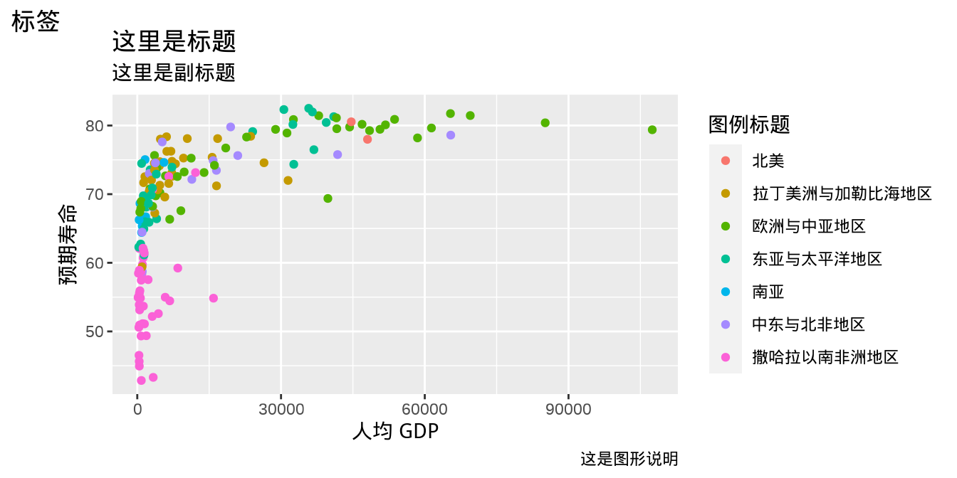
用函数 labs() 可以添加横轴、纵轴、图例的标题,整个图片的标题和副标题等。下图 图 6.2 (a) 是默认设置下显示的标签内容,而 图 6.2 (b) 是用户指定标签内容后的显示效果。
ggplot(data = gapminder_2007, aes(x = gdpPercap, y = lifeExp)) +
  geom_point(aes(color = region))
ggplot(data = gapminder_2007, aes(x = gdpPercap, y = lifeExp)) +
  geom_point(aes(color = region)) +
  labs(x = "人均 GDP", y = "预期寿命", tag = "标签",
       title = "这里是标题", caption = "这是图形说明",
       subtitle = "这里是副标题", color = "图例标题")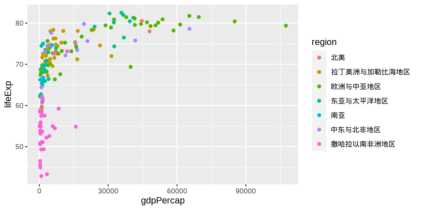
6.3 刻度
有时候 图 6.1 (c) 看起来不太好,收入低的国家太多,聚集在一起,重叠覆盖比较严重。而高收入国家相对较少,分布稀疏,距离低收入比较远,数据整体的分布很不平衡。此时,可以考虑对横轴标度做一些变换,常用的有以 10 为底的对数变换,如 图 6.3 。
library(scales)
ggplot(data = gapminder_2007, aes(x = gdpPercap, y = lifeExp)) +
  geom_point() +
  scale_x_log10() +
  labs(x = "人均 GDP", y = "预期寿命")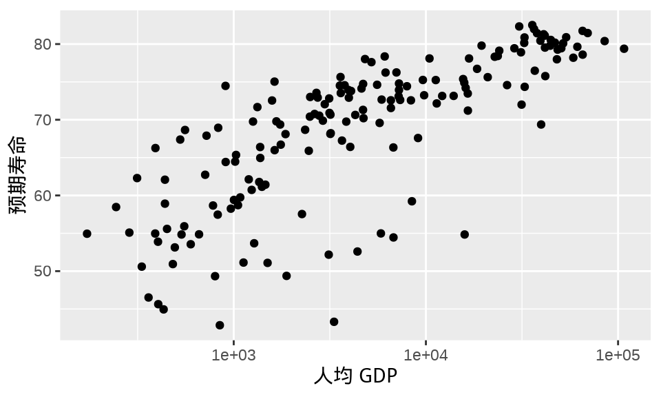
为了更加醒目地展示横轴做了对数变换,需要添加对应的刻度标签。scales 包 (H. Wickham 和 Seidel 2022) 提供很多刻度标签支持,比如函数 label_log() 默认提供以 10 为底的刻度标签,如 图 6.4 。
ggplot(data = gapminder_2007, aes(x = gdpPercap, y = lifeExp)) +
  geom_point() +
  scale_x_log10(labels = label_log()) +
  labs(x = "人均 GDP", y = "预期寿命")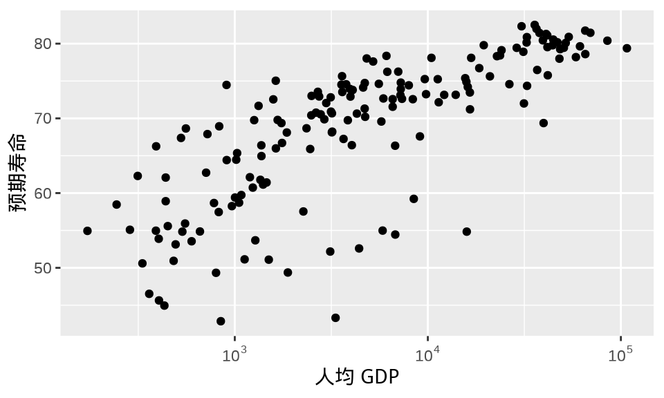
这其实还不够,有的刻度标签含义不够显然,且看 图 6.4 的横轴第一个刻度标签 \(10^{2.48}\) 是用来替换 图 6.3 的横轴第一个刻度标签 300。10 的 2.48 次方可不容易看出是 300 的意思,实际上它等于 302。因此,结合人均 GDP 的实际范围,有必要适当调整横轴显示范围,这可以在函数 scale_x_log10() 中设置参数 limits,横轴刻度标签会随之适当调整,调整后的效果如 图 6.5 。
ggplot(data = gapminder_2007, aes(x = gdpPercap, y = lifeExp)) +
  geom_point() +
  scale_x_log10(labels = label_log(), limits = c(100, 110000)) +
  labs(x = "人均 GDP", y = "预期寿命")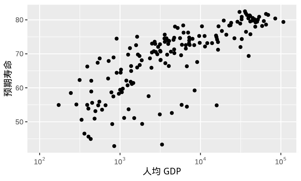
根据横轴所代表的人均 GDP (单位:美元)的实际含义,其实,可以进一步,添加更多的信息,即刻度标签带上数量单位,此处是美元符号。scales 包提供的函数 label_dollar() 可以实现,效果如 图 6.6 。
ggplot(data = gapminder_2007, aes(x = gdpPercap, y = lifeExp)) +
  geom_point() +
  scale_x_log10(labels = label_dollar(), limits = c(100, 110000)) +
  labs(x = "人均 GDP", y = "预期寿命")
最后,有必要添加次刻度线作为辅助参考线。图中点与点之间的横向距离代表人均 GDP 差距,以 10 为底的对数变换不是线性变化的,肉眼识别起来有点困难。从 100 美元到 100000 美元,在 100 美元、1000 美元、10000 美元和 100000 美元之间均添加 10 条次刻度线,每个区间内相邻的两条次刻度线之差保持恒定。下面构造刻度线的位置,了解原值和对数变换后的对应关系。
#>  [1] 1.000000 1.301030 1.477121 1.602060 1.698970 1.778151 1.845098 1.903090
#>  [9] 1.954243 2.000000 2.301030 2.477121 2.602060 2.698970 2.778151 2.845098
#> [17] 2.903090 2.954243 3.000000 3.301030 3.477121 3.602060 3.698970 3.778151
#> [25] 3.845098 3.903090 3.954243 4.000000 4.301030 4.477121 4.602060 4.698970
#> [33] 4.778151 4.845098 4.903090 4.954243 5.000000#> [1] " 10" " 20" " 30" " 40" " 50" " 60" " 70"
#> [8] " 80" " 90" " 100" " 200" " 300" " 400" " 500"
#> [15] " 600" " 700" " 800" " 900" " 1,000" " 2,000" " 3,000"
#> [22] " 4,000" " 5,000" " 6,000" " 7,000" " 8,000" " 9,000" " 10,000"
#> [29] " 20,000" " 30,000" " 40,000" " 50,000" " 60,000" " 70,000" " 80,000"
#> [36] " 90,000" "100,000"函数 scale_x_log10() 提供参数 minor_breaks 设定刻度线的位置。最终效果如 图 6.7 。
6.4 配色
好的配色可以让图形产生眼前一亮的效果,R 语言社区在统计图形领域深耕 20 多年,陆续涌现很多专门调色的 R 包,常见的有:
- RColorBrewer (Neuwirth 2022) (https://github.com/axismaps/colorbrewer/)
- munsell (C. Wickham 2018) (https://github.com/cwickham/munsell/)
- colorspace (Zeileis 等 2020) (https://colorspace.r-forge.r-project.org/)
- paletteer (Hvitfeldt 2021) (https://github.com/EmilHvitfeldt/paletteer)
- scico (Pedersen 和 Crameri 2022) (https://github.com/thomasp85/scico)
- viridis (Garnier 等 2021) (https://github.com/sjmgarnier/viridis/)
- viridisLite (Garnier 等 2021) (https://github.com/sjmgarnier/viridisLite/)
- colormap (Karambelkar 2016) (https://github.com/bhaskarvk/colormap)
ggplot2 提供多种方式给图形配色,最常见的要数函数 scale_color_brewer(),它调用 RColorBrewer 包制作离散型的调色板,根据离散型变量的具体情况,可分为发散型 qualitative、对撞型 Diverging、有序型 Sequential。在图 图 6.7 的基础上,将分类型的区域变量映射给散点的颜色,即得到 图 6.8 。
ggplot(data = gapminder_2007, aes(x = gdpPercap, y = lifeExp)) +
  geom_point(aes(color = region)) +
  scale_color_brewer(palette = "Set1") +
  scale_x_log10(
    labels = label_dollar(), minor_breaks = mb, limits = c(100, 110000)
  ) +
  labs(x = "人均 GDP", y = "预期寿命", color = "区域")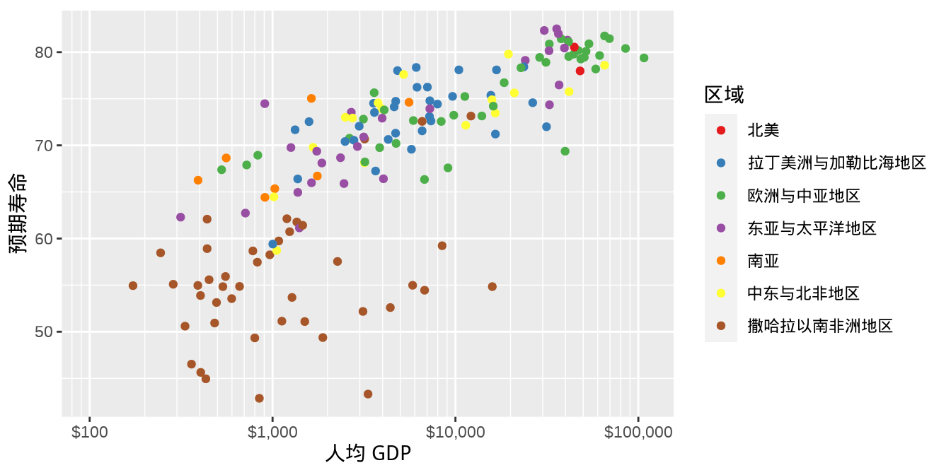
另一种方式是调用函数 scale_color_manual(),需要用户给分类变量值逐个指定颜色,即提供一个命名的向量,效果如 图 6.9 。
ggplot(data = gapminder_2007, aes(x = gdpPercap, y = lifeExp)) +
  geom_point(aes(color = region)) +
  scale_color_manual(values = c(
    `拉丁美洲与加勒比海地区` = "#E41A1C", `撒哈拉以南非洲地区` = "#377EB8",
    `欧洲与中亚地区` = "#4DAF4A", `中东与北非地区` = "#984EA3",
    `东亚与太平洋地区` = "#FF7F00", `南亚` = "#FFFF33", `北美` = "#A65628"
  )) +
  scale_x_log10(
    labels = label_dollar(), minor_breaks = mb, limits = c(100, 110000)
  ) +
  labs(x = "人均 GDP", y = "预期寿命", color = "区域")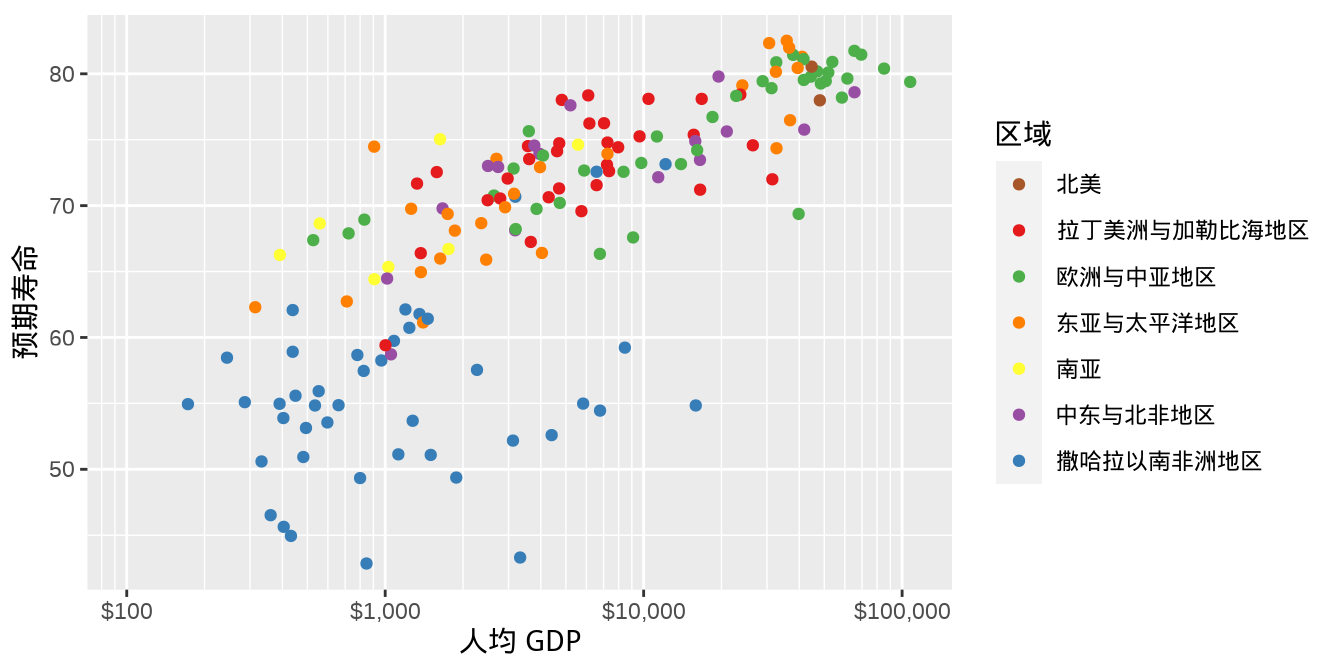
6.5 图例
在 图 6.8 的基础上,继续将每个国家的人口总数映射给点的大小,绘制气泡图。此时有两个视觉映射变量 — 离散型的变量 country (国家)和连续型的变量 pop (人口总数)。不仅仅是图层函数 geom_point(),所有的几何图层都提供参数 show.legend 来控制图例的显示或隐藏。传递命名逻辑向量还可以在多个图例中选择性保留。 图 6.10 在两个图例中保留一个,即人口总数。
ggplot(data = gapminder_2007, aes(x = gdpPercap, y = lifeExp)) +
  geom_point(aes(color = region, size = pop),
    show.legend = c(color = FALSE, size = TRUE)
  ) +
  scale_color_manual(values = c(
    `拉丁美洲与加勒比海地区` = "#E41A1C", `撒哈拉以南非洲地区` = "#377EB8",
    `欧洲与中亚地区` = "#4DAF4A", `中东与北非地区` = "#984EA3",
    `东亚与太平洋地区` = "#FF7F00", `南亚` = "#FFFF33", `北美` = "#A65628"
  )) +
  scale_size(range = c(2, 12)) +
  scale_x_log10(
    labels = label_dollar(), minor_breaks = mb, limits = c(100, 110000)
  ) +
  labs(x = "人均 GDP", y = "预期寿命", size = "人口总数")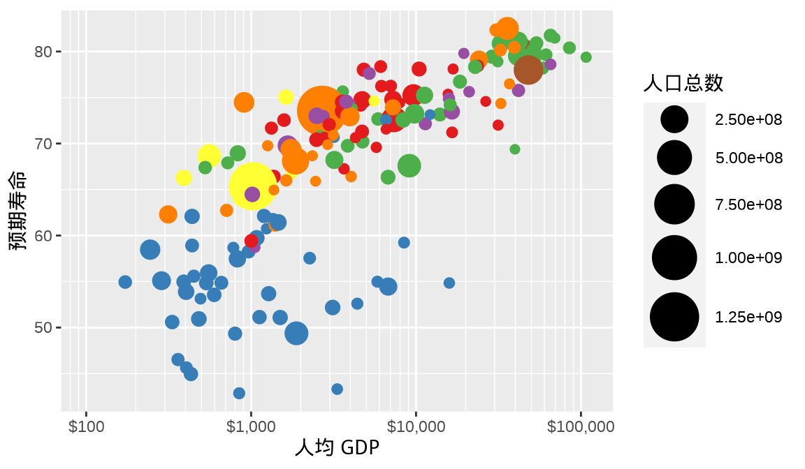
全世界各个国家的人口总数从百万级横跨到十亿级,根据此实际情况,适当调整图例刻度标签是很有必要的,可以让图例内容更具可读性。 图 6.11 是修改图例刻度标签后的效果,其中 M 表示 Million(百万),B 表示 Billion (十 亿)。
ggplot(data = gapminder_2007, aes(x = gdpPercap, y = lifeExp)) +
  geom_point(aes(color = region, size = pop),
    show.legend = c(color = FALSE, size = TRUE)
  ) +
  scale_color_manual(values = c(
    `拉丁美洲与加勒比海地区` = "#E41A1C", `撒哈拉以南非洲地区` = "#377EB8",
    `欧洲与中亚地区` = "#4DAF4A", `中东与北非地区` = "#984EA3",
    `东亚与太平洋地区` = "#FF7F00", `南亚` = "#FFFF33", `北美` = "#A65628"
  )) +
  scale_size(range = c(2, 12), labels = label_number(scale_cut = cut_short_scale())) +
  scale_x_log10(
    labels = label_dollar(), minor_breaks = mb, limits = c(100, 110000)
  ) +
  labs(x = "人均 GDP", y = "预期寿命", size = "人口总数")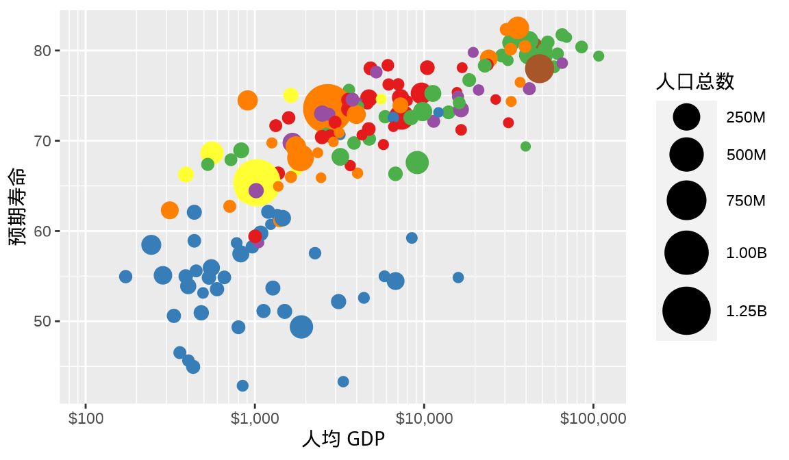
6.6 主题
主题就是一系列风格样式的集合,提前设定标题、文本、坐标轴、图例等元素的默认参数,供后续调用。10 年来,R 语言社区陆续出现很多主题包。
- ggthemes (Arnold 2021) 收集了网站(如 Fivethirtyeight)、杂志(如《经济学家》)、软件(如 Stata)等的配色主题,打包成可供 ggplot2 绘图的主题,更多内容见 (https://github.com/jrnold/ggthemes)
- ggsci (Xiao 2018) 包收集了多份期刊杂志的图形配色,将其融入 ggplot2 绘图主题中,更多内容见 (https://github.com/road2stat/ggsci)。
- ggpubr (Kassambara 2022) 包在 ggplot2 之上封装一套更加易用的函数,可以快速绘制出版级的统计图形 (https://github.com/kassambara/ggpubr)。
- ggcharts (Neitmann 2020) 包类似 ggpubr 包,也提供一套更加快捷的函数接口,缩短数据可视化的想法与实际图形的距离,更多内容见 (https://github.com/thomas-neitmann/ggcharts)。
- ggthemr (Tobin 2020) 是比较早的 ggplot2 主题包,上游依赖少,更多内容见 (https://github.com/Mikata-Project/ggthemr)。
- ggtech (Bion 2018) 包收集了许多科技公司的设计风格,将其制作成可供 ggplot2 绘图使用的主题,更多内容见 (https://github.com/ricardo-bion/ggtech)。
- bbplot (Stylianou 等 2022) 为 BBC 新闻定制的一套主题,更多内容见 (https://github.com/bbc/bbplot)。
- pilot (Hawkins 2022) 包提供一套简洁的 ggplot2 主题,特别是适合展示分类、离散型数据,更多内容见 (https://github.com/olihawkins/pilot)。
- ggthemeassist (Gross 和 Ottolinger 2016) 包提供 RStudio IDE 插件,帮助用户以鼠标点击的交互方式设置 ggplot2 图形的主题样式,更多内容见 (https://github.com/calligross/ggthemeassist)。
在 图 6.11 的基础上,以 ggplot2 包内置的主题 theme_classic() 替换默认的主题,效果如下 图 6.12 ,这是一套非常经典的主题,它去掉所有的背景色和参考系,显得非常简洁。
ggplot(data = gapminder, aes(x = gdpPercap, y = lifeExp)) +
  geom_point(
    data = function(x) subset(x, year == 2007),
    aes(fill = region, size = pop), shape = 21, col = "white",
    show.legend = c(fill = TRUE, size = FALSE)
  ) +
  scale_fill_manual(values = c(
    `拉丁美洲与加勒比海地区` = "#E41A1C", `撒哈拉以南非洲地区` = "#377EB8",
    `欧洲与中亚地区` = "#4DAF4A", `中东与北非地区` = "#984EA3",
    `东亚与太平洋地区` = "#FF7F00", `南亚` = "#FFFF33", `北美` = "#A65628"
  )) +
  scale_size(range = c(2, 12)) +
  scale_x_log10(
    labels = label_dollar(), minor_breaks = mb, limits = c(100, 110000)
  ) +
  theme_classic() +
  labs(x = "人均 GDP", y = "预期寿命", fill = "区域")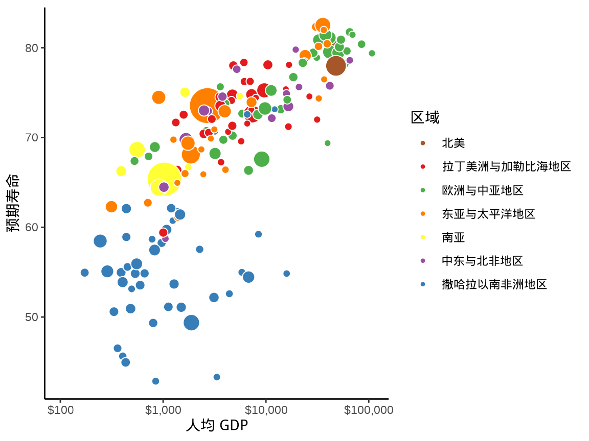
在已有主题的基础上,还可以进一步细微调整,比如,将图例移动至绘图区域的下方,见 图 6.13 。
ggplot(data = gapminder, aes(x = gdpPercap, y = lifeExp)) +
  geom_point(
    data = function(x) subset(x, year == 2007),
    aes(fill = region, size = pop), shape = 21, col = "white",
    show.legend = c(fill = TRUE, size = FALSE)
  ) +
  scale_fill_manual(values = c(
    `拉丁美洲与加勒比海地区` = "#E41A1C", `撒哈拉以南非洲地区` = "#377EB8",
    `欧洲与中亚地区` = "#4DAF4A", `中东与北非地区` = "#984EA3",
    `东亚与太平洋地区` = "#FF7F00", `南亚` = "#FFFF33", `北美` = "#A65628"
  )) +
  scale_size(range = c(2, 12)) +
  scale_x_log10(
    labels = label_dollar(), minor_breaks = mb, limits = c(100, 110000)
  ) +
  theme_classic() +
  theme(legend.position = "bottom") +
  labs(x = "人均 GDP", y = "预期寿命", fill = "区域")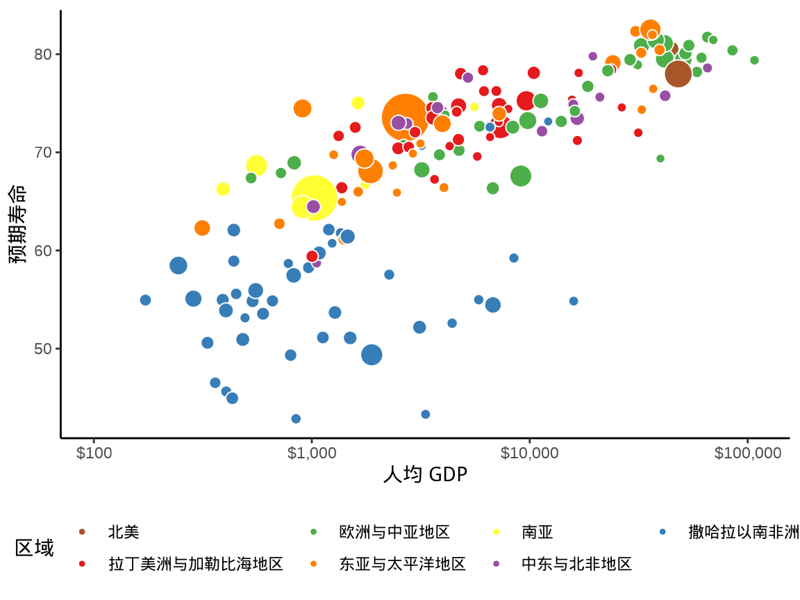
或者用户觉得合适的任意位置。
ggplot(data = gapminder, aes(x = gdpPercap, y = lifeExp)) +
  geom_point(
    data = function(x) subset(x, year == 2007),
    aes(fill = region, size = pop), shape = 21, col = "white",
    show.legend = c(fill = TRUE, size = FALSE)
  ) +
  scale_fill_manual(values = c(
    `拉丁美洲与加勒比海地区` = "#E41A1C", `撒哈拉以南非洲地区` = "#377EB8",
    `欧洲与中亚地区` = "#4DAF4A", `中东与北非地区` = "#984EA3",
    `东亚与太平洋地区` = "#FF7F00", `南亚` = "#FFFF33", `北美` = "#A65628"
  )) +
  scale_size(range = c(2, 12)) +
  scale_x_log10(
    labels = label_dollar(), minor_breaks = mb, limits = c(100, 110000)
  ) +
  theme_classic() +
  theme(legend.position =  c(0.875, 0.3)) +
  labs(x = "人均 GDP", y = "预期寿命", fill = "区域")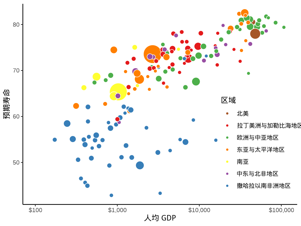
或者更换其它主题,比如 ggthemes 包内置极简主题 theme_tufte(),它仅保留主刻度线,更加凸显数据。
library(ggthemes)
ggplot(data = gapminder, aes(x = gdpPercap, y = lifeExp)) +
  geom_point(
    data = function(x) subset(x, year == 2007),
    aes(fill = region, size = pop),
    show.legend = c(fill = TRUE, size = FALSE),
    shape = 21, col = "white"
  ) +
  scale_fill_manual(values = c(
    `拉丁美洲与加勒比海地区` = "#E41A1C", `撒哈拉以南非洲地区` = "#377EB8",
    `欧洲与中亚地区` = "#4DAF4A", `中东与北非地区` = "#984EA3",
    `东亚与太平洋地区` = "#FF7F00", `南亚` = "#FFFF33", `北美` = "#A65628"
  )) +
  scale_size(range = c(2, 12)) +
  scale_x_log10(
    labels = label_dollar(), minor_breaks = mb, limits = c(100, 110000)
  ) +
  theme_tufte(base_family = "Noto Serif CJK SC") +
  theme(legend.position =  c(0.875, 0.3)) +
  labs(x = "人均 GDP", y = "预期寿命", fill = "区域")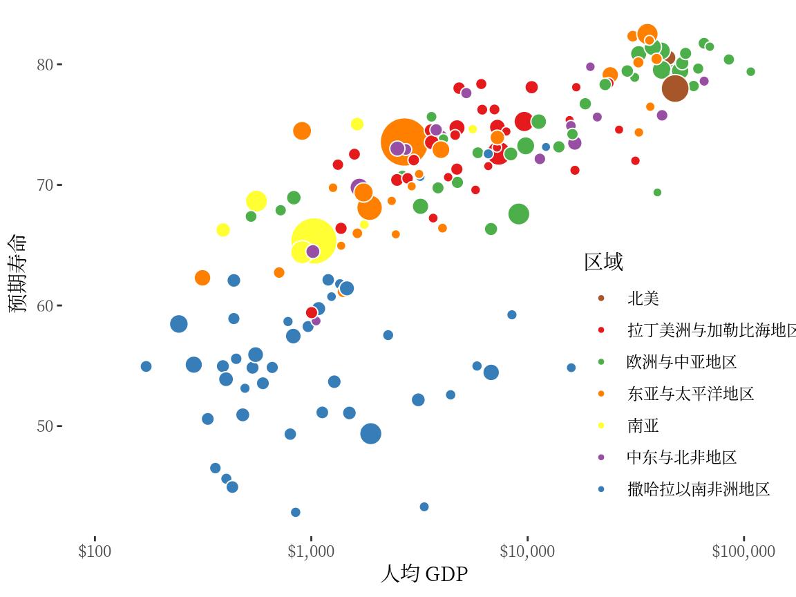
6.7 注释
注释可以是普通文本,数学公式,还可以是图形照片、表情包。注释功能非常强大,但也是非常灵活,往往使用起来颇费功夫,需要结合数据情况,从图形所要传递的信息出发,适当添加。R 语言社区陆续出现一些扩展包,让用户使用起来更方便些。
- ggrepel (Slowikowski 2021) 包可以通过添加一定距离的扰动,可以缓解文本重叠的问题,更多内容见 (https://github.com/slowkow/ggrepel)。
- ggtext (Wilke 2020) 包支持以 Markdown 语法添加丰富的文本内容,更多内容见 (https://github.com/wilkelab/ggtext)。
- string2path (Yutani 2022) 包字体轮廓生成路径,注释文本随路径变化,更多内容见 (https://github.com/yutannihilation/string2path)。
- ggimage (Yu 2022) 包提供图像图层,实现以图片代替散点的效果,图片还可以是表情包,更多内容见 (https://github.com/GuangchuangYu/ggimage)。
在 图 6.15 的基础上,给人口总数大于 2 亿的国家添加文本注释。这可以用 ggplot2 包提供的文本图层函数 geom_text() 实现,效果如 图 6.16 。
library(ggrepel)
ggplot(data = gapminder, aes(x = gdpPercap, y = lifeExp)) +
  geom_point(
    data = function(x) subset(x, year == 2007),
    aes(fill = region, size = pop),
    show.legend = c(fill = TRUE, size = FALSE),
    shape = 21, col = "white"
  ) +
  scale_fill_manual(values = c(
    `拉丁美洲与加勒比海地区` = "#E41A1C", `撒哈拉以南非洲地区` = "#377EB8",
    `欧洲与中亚地区` = "#4DAF4A", `中东与北非地区` = "#984EA3",
    `东亚与太平洋地区` = "#FF7F00", `南亚` = "#FFFF33", `北美` = "#A65628"
  )) +
  scale_x_log10(
    labels = label_dollar(), minor_breaks = mb, limits = c(100, 110000)
  ) +
  geom_text(
    data = function(x) subset(x, year == 2007 & pop >= 20 * 10^7),
    aes(label = country), show.legend = FALSE
  ) +
  scale_size(range = c(2, 12)) +
  theme_tufte(base_family = "Noto Serif CJK SC") +
  theme(legend.position = c(0.9, 0.3)) +
  labs(x = "人均 GDP", y = "预期寿命", fill = "区域")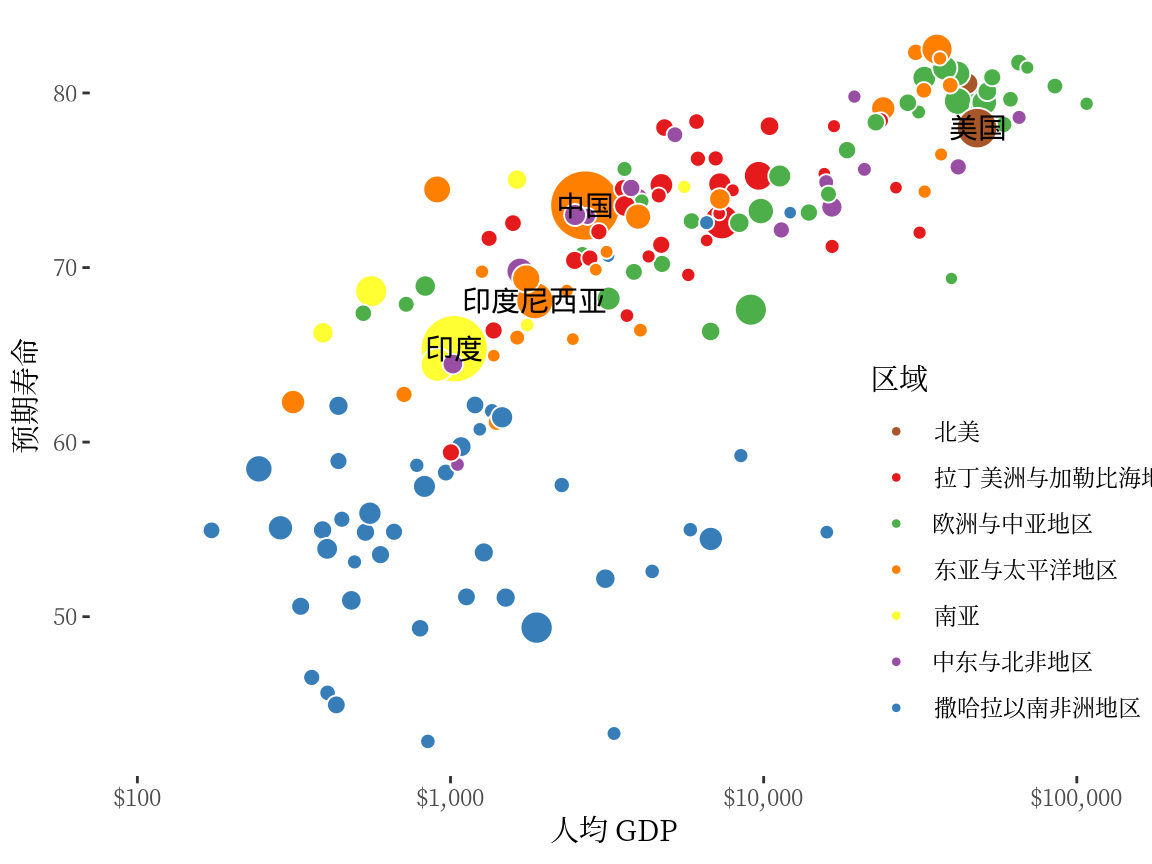
当需要给许多点添加文本注释时,就难以避免地遇到注释文本重叠的问题。比如给人口总数大于 5000 万的国家添加文本注释,此时,适合使用 ggrepel 包,调用函数 geom_text_repel() — 这是一个新的文本图层,通过添加适当的位移缓解文本重叠问题。
library(ggrepel)
ggplot(data = gapminder, aes(x = gdpPercap, y = lifeExp)) +
  geom_point(data = function(x) subset(x, year == 2007),
             aes(fill = region, size = pop),
    show.legend = c(fill = TRUE, size = FALSE),
    shape = 21, col = "white"
  ) +
  scale_fill_manual(values = c(
    `拉丁美洲与加勒比海地区` = "#E41A1C", `撒哈拉以南非洲地区` = "#377EB8",
    `欧洲与中亚地区` = "#4DAF4A", `中东与北非地区` = "#984EA3",
    `东亚与太平洋地区` = "#FF7F00", `南亚` = "#FFFF33", `北美` = "#A65628"
  )) +
  scale_x_log10(
    labels = label_dollar(), minor_breaks = mb, limits = c(100, 110000)
  ) +
  geom_text_repel(
    data = function(x) subset(x, year == 2007 & pop >= 5 * 10^7),
    aes(label = country), size = 3, max.overlaps = 50,
    segment.colour = "gray", seed = 2022, show.legend = FALSE
  ) +
  scale_size(range = c(2, 12)) +
  theme_tufte(base_family = "Noto Serif CJK SC") +
  theme(legend.position = c(0.9, 0.3)) +
  labs(x = "人均 GDP", y = "预期寿命", fill = "区域")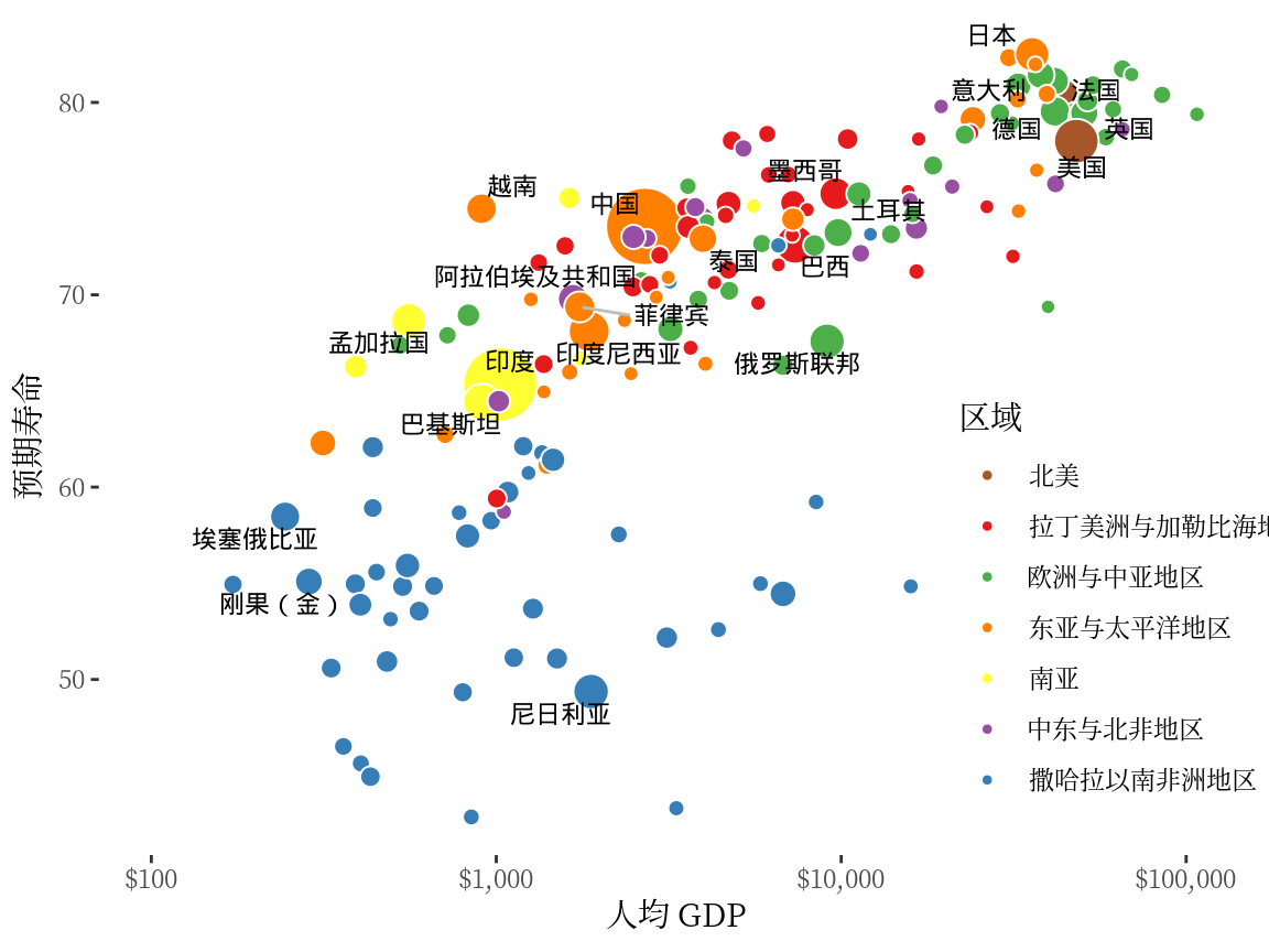
6.8 分面
ggplot2 包有两个函数 facet_wrap() 和 facet_grid() 都可以用来实现分面操作,分面的目的是将数据切分,一块一块地展示。下面在 图 6.15 的基础上,按收入水平变量分面,即将各个国家或地区按收入水平分开,效果如 图 6.18 所示。facet_grid() 与 facet_wrap() 的效果是类似的,就不再赘述了。
ggplot(data = gapminder, aes(x = gdpPercap, y = lifeExp)) +
  geom_point(data = function(x) subset(x, year == 2007),
             aes(fill = region, size = pop),
    show.legend = c(fill = TRUE, size = FALSE),
    shape = 21, col = "white"
  ) +
  scale_fill_manual(values = c(
    `拉丁美洲与加勒比海地区` = "#E41A1C", `撒哈拉以南非洲地区` = "#377EB8",
    `欧洲与中亚地区` = "#4DAF4A", `中东与北非地区` = "#984EA3",
    `东亚与太平洋地区` = "#FF7F00", `南亚` = "#FFFF33", `北美` = "#A65628"
  )) +
  scale_size(range = c(2, 12)) +
  scale_x_log10(labels = label_log(), limits = c(100, 110000)) +
  facet_wrap(facets = ~income_level, ncol = 2) +
  theme_classic() +
  labs(x = "人均 GDP", y = "预期寿命", fill = "区域")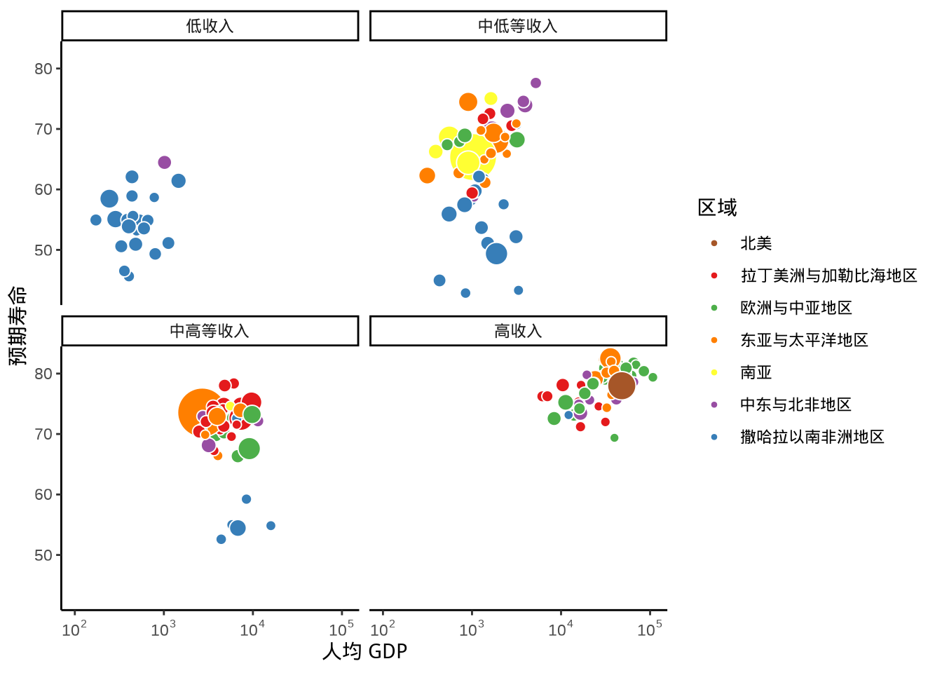
在函数 facet_wrap() 内设置不同的参数值,会有不同的排列效果。设置 ncol = 3,意味着排成 3 列,而分类变量 continent 总共有 5 种不同的类别,因此将会是 3 列 2 行的布局,效果如下 图 6.19 。
ggplot(data = gapminder, aes(x = gdpPercap, y = lifeExp)) +
  geom_point(data = function(x) subset(x, year == 2007),
             aes(fill = region, size = pop),
    show.legend = c(fill = TRUE, size = FALSE),
    shape = 21, col = "white"
  ) +
  scale_fill_manual(values = c(
    `拉丁美洲与加勒比海地区` = "#E41A1C", `撒哈拉以南非洲地区` = "#377EB8",
    `欧洲与中亚地区` = "#4DAF4A", `中东与北非地区` = "#984EA3",
    `东亚与太平洋地区` = "#FF7F00", `南亚` = "#FFFF33", `北美` = "#A65628"
  )) +
  scale_size(range = c(2, 12)) +
  scale_x_log10(labels = label_log(), limits = c(100, 110000)) +
  facet_wrap(facets = ~income_level, ncol = 3) +
  theme_classic() +
  theme(legend.position = c(0.9, 0.2)) +
  labs(x = "人均 GDP", y = "预期寿命", fill = "区域")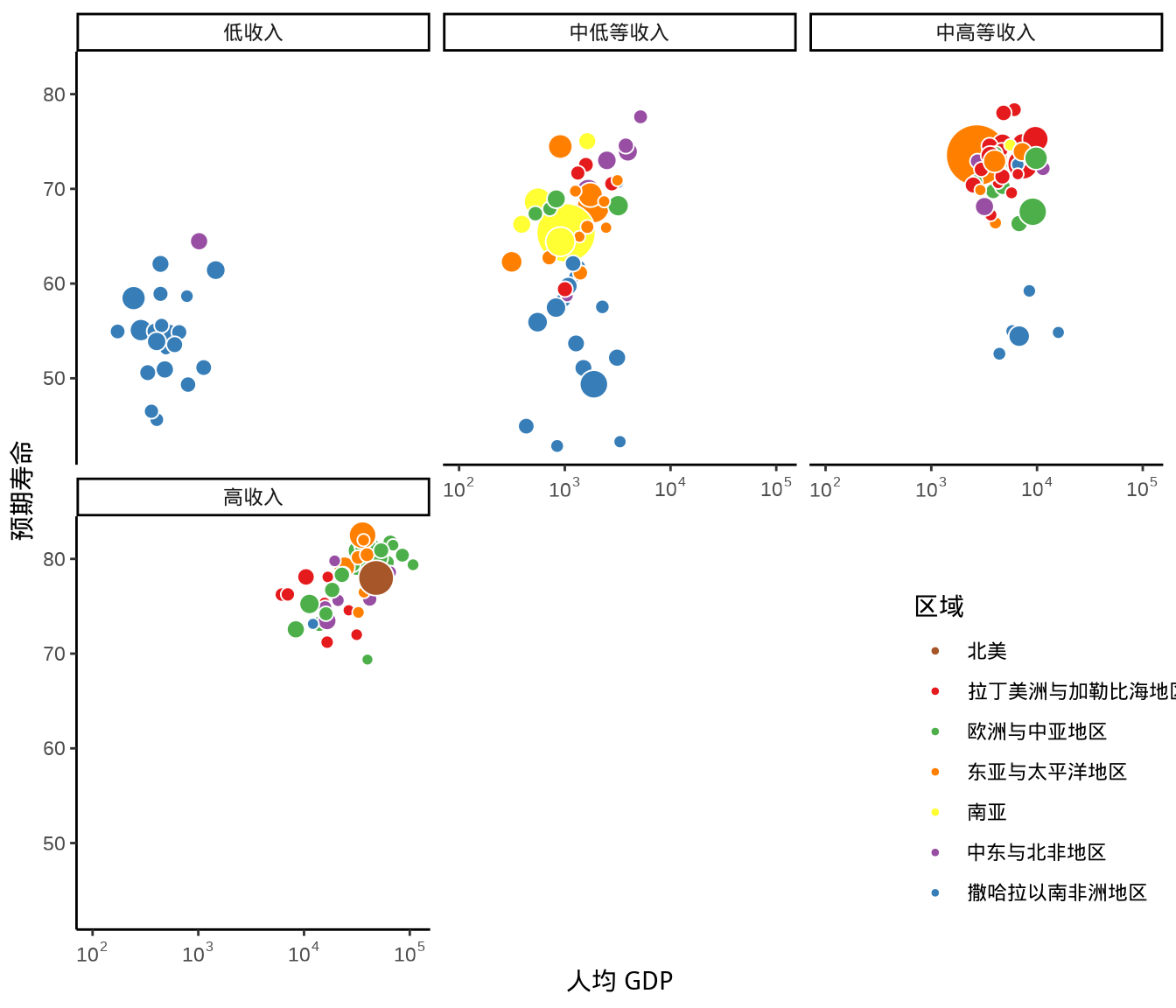
6.9 动画
从 1991 年至 2020 年,gapminder 数据集一共是 30 年的数据。根据 2007 年的数据绘制了 图 6.20 ,每年的数据绘制一幅图像,30 年总共可获得 30 帧图像,再以每秒播放 6 帧图像的速度将 30 帧图像合成 GIF 动画。因此,设置这个动画总共 30 帧,每秒播放的图像数为 6。
gganimate 包提供一套代码风格类似 ggplot2 包的动态图形语法,可以非常顺滑地与之连接。在了解了 ggplot2 绘制图形的过程后,用 gganimate 包制作动画是非常容易的。gganimate 包会调用 gifski (https://github.com/r-rust/gifski) 包来合成动画,因此,除了安装 gganimate 包,还需要安装 gifski 包。接着,在已有的 ggplot2 绘图代码基础上,再追加一个转场图层函数 transition_time(),这里是按年逐帧展示图像,因此,其转场的时间变量为 gapminder 数据集中的变量 year。
library(gganimate)
ggplot(data = gapminder, aes(x = gdpPercap, y = lifeExp)) +
  geom_point(aes(fill = region, size = pop),
    show.legend = c(fill = TRUE, size = FALSE),
    alpha = 0.65, shape = 21, col = "white"
  ) +
  scale_fill_manual(values = c(
    `拉丁美洲与加勒比海地区` = "#E41A1C", `撒哈拉以南非洲地区` = "#377EB8",
    `欧洲与中亚地区` = "#4DAF4A", `中东与北非地区` = "#984EA3",
    `东亚与太平洋地区` = "#FF7F00", `南亚` = "#FFFF33", `北美` = "#A65628"
  )) +
  scale_size(range = c(2, 12), labels = label_number(scale_cut = cut_short_scale())) +
  scale_x_log10(labels = label_log(), limits = c(10, 130000)) +
  facet_wrap(facets = ~income_level) +
  theme_classic() +
  labs(
    title = "{frame_time} 年", x = "人均 GDP",
    y = "预期寿命", size = "人口总数", fill = "区域"
  ) +
  transition_time(time = year)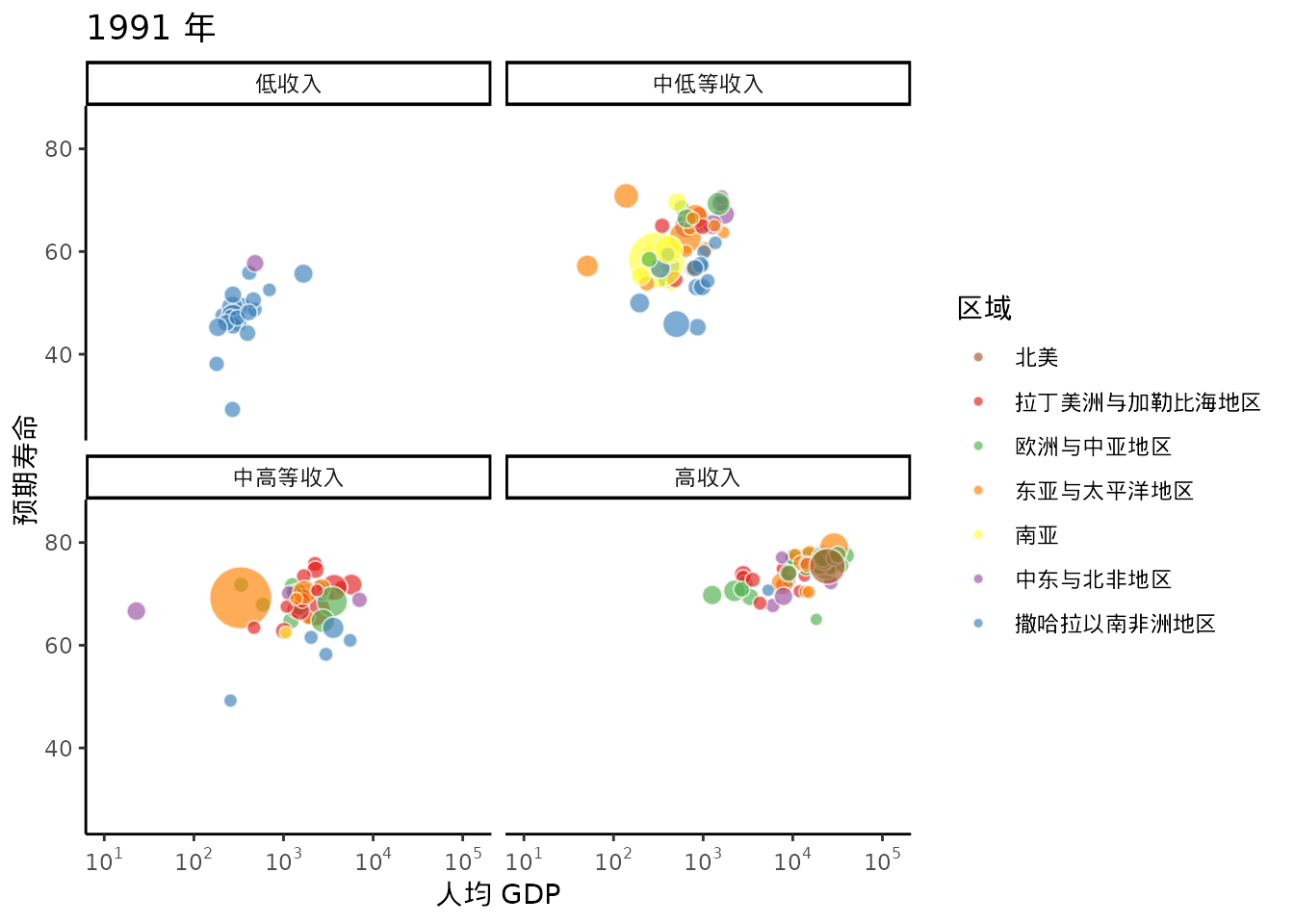
6.10 组合
将多幅小图组合起来构成一幅大图也是常见的需求,常见于出版级、产品级的作品中。组合涉及到布局,布局涉及到层次。有的组合图是从不同角度呈现数据,有的组合图是从传递信息的主次出发,等等。patchwork 包是非常流行的一个基于 ggplot2 的用于图形组合的 R 包,下面基于 faithful 数据展示绘制组合图形的过程。
首先根据喷发时间将 faithful 数据分成两组。
绘制分组散点图,叠加二维核密度曲线。
将上图中的图例单独抽取出来,作为一个子图。
获得图例后,原图中不需要图例了。
准备两个箱线图分别描述 faithful 数据集中的等待时间 waiting 和喷发时间 eruptions 。
boxplot_left <- ggplot(faithful, aes(group, waiting, fill = group)) +
  geom_boxplot() +
  theme_classic() +
  theme(
    legend.position = "none", axis.ticks.x = element_blank(),
    axis.text.x = element_blank(), axis.title.x = element_blank()
  )

boxplot_bottom <- ggplot(faithful, aes(group, eruptions, fill = group)) +
  geom_boxplot() +
  theme_classic() +
  theme(
    legend.position = "none", axis.ticks.y = element_blank(),
    axis.text.y = element_blank(), axis.title.y = element_blank()
  ) +
  coord_flip()
加载 patchwork 包,使用函数 wrap_plots() 组合 boxplot_left 、scatterplot 、legend 和 boxplot_bottom 四个子图,最终效果见下图。
library(patchwork)
top <- wrap_plots(boxplot_left, scatterplot, ncol = 2, widths = c(0.2, 0.8))
bottom <- wrap_plots(legend, boxplot_bottom, ncol = 2, widths = c(0.22, 0.8))
final <- wrap_plots(top, bottom, nrow = 2, heights = c(0.8, 0.2))
final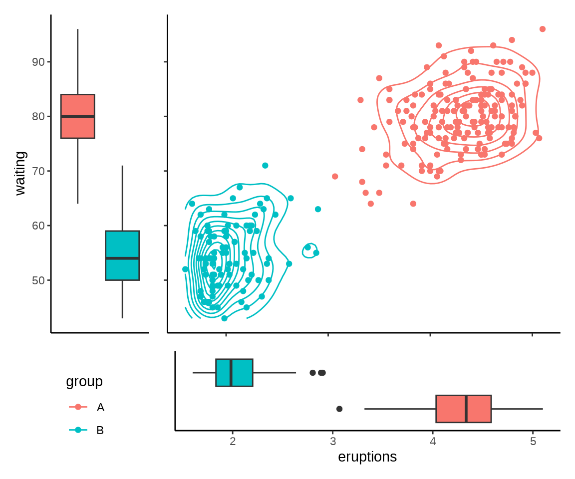
主图是占据着最大篇幅的叠加二维密度曲线的散点图,展示数据的二维分布,两个箱线图辅助展示等待时间 waiting 和喷发时间 eruptions 的分布,而左下角的图例是次要的说明。
6.11 艺术
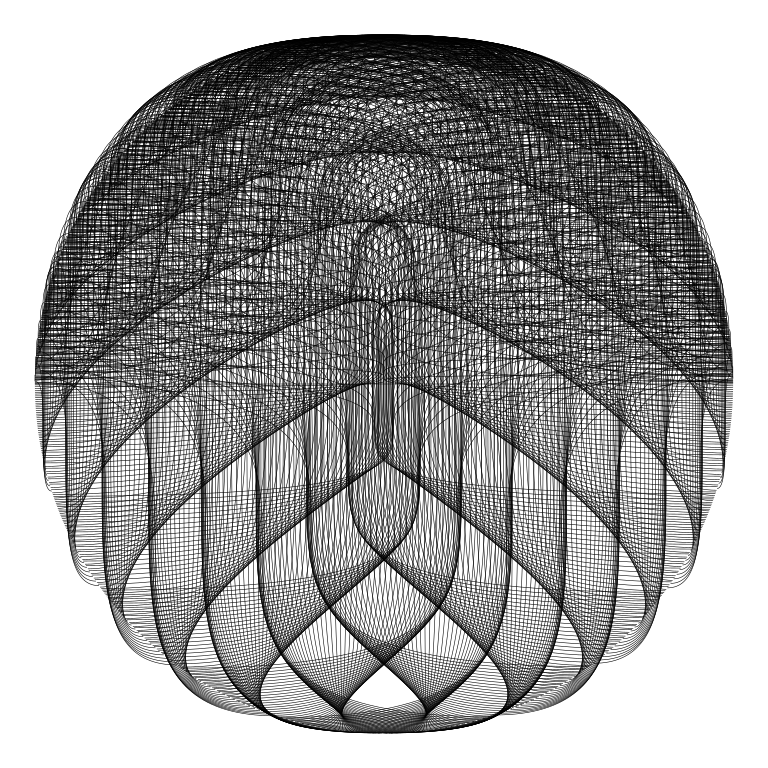
Georgios Karamanis 基于 R 语言和扩展包 ggforce 制作了一系列生成艺术(Generative Arts)作品。下图是 ggforce 包的 4 个图层函数 geom_regon()、 geom_spiro()、 geom_diagonal() 和 geom_spoke() 分别生成的四幅图片。
library(ggforce)
s <- 900
ggplot() +
  geom_regon(aes(
    x0 = cos((1:s) / 57), y0 = sin((1:s) / 57),
    sides = 6, r = cos((1:s) / 24),
    angle = cos((1:s) / 23), color = 1:s %% 15
  ),
  linewidth = 0.2, fill = NA, linetype = "twodash"
  ) +
  scale_color_viridis_c(option = 15, guide = "none") +
  coord_fixed() +
  theme_void()

r <- seq(1, 11, 0.1)
ggplot() +
  geom_spiro(aes(r = r, R = r * 20, d = r^2, outer = T, color = r %% 10), linewidth = 3) +
  scale_color_viridis_c(option = "turbo") +
  coord_fixed() +
  theme_void() +
  theme(legend.position = "none")

s <- 1200
ggplot() +
  geom_diagonal(aes(
    x = cos(seq(0, pi, length.out = s)),
    y = sin(seq(0, pi, length.out = s)),
    xend = cos(seq(0, 360 * pi, length.out = s)),
    yend = sin(seq(0, 360 * pi, length.out = s))
  ),
  linewidth = 0.1, strength = 1
  ) +
  coord_fixed() +
  theme_void()

e <- 1e-3
s <- 1e4
t <- pi / 2 * cumsum(seq(e, -e, length.out = s))^3
ggplot() +
  geom_spoke(aes(
    x = cumsum(cos(t)), y = cumsum(sin(t)),
    angle = t, color = t, radius = 1:s %% 500
  ), alpha = 0.5) +
  scale_color_distiller(palette = 15, guide = "none") +
  coord_fixed() +
  theme_void()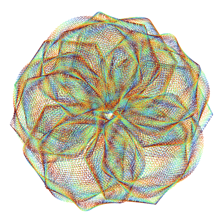
geom_regon()

geom_spiro()
geom_diagonal()

geom_spoke()
需要充满想象,或借助数学、物理方程,或借助算法、数据生成。好看,但没什么用的生成艺术作品。