| 地区 | 人口数/男 | 人口数/女 | 性别比(女=100) | 区域 |
|---|---|---|---|---|
| 北京 | 8937161 | 8814520 | 101.39 | 城市 |
| 天津 | 5610161 | 5322931 | 105.40 | 城市 |
| 河北 | 11010407 | 11119188 | 99.02 | 城市 |
| 山西 | 6588788 | 6608849 | 99.70 | 城市 |
| 内蒙古 | 4714495 | 4731924 | 99.63 | 城市 |
| 辽宁 | 12626419 | 12946058 | 97.53 | 城市 |
8 统计图形
- 章节 8.1 探索、展示数据中隐含的分布信息,具体有箱线图、提琴图、直方图、密度图、岭线图和抖动图。
- 章节 8.2 探索、展示数据中隐含的相关信息,这种相关具有一般性,比如线性和非线性相关,位序关系、包含关系、依赖关系等,具体有散点图、气泡图、凹凸图、韦恩图、甘特图和网络图。
- 章节 8.3 探索、展示数据中隐含的不确定性,统计中描述不确定性有很多概念,比如置信区间、假设检验中的 P 值,统计模型中的预测值及其预测区间,模型残差隐含的分布,模型参数分量的边际分布及其效应,贝叶斯视角下的模型参数的后验分布。
8.1 描述分布
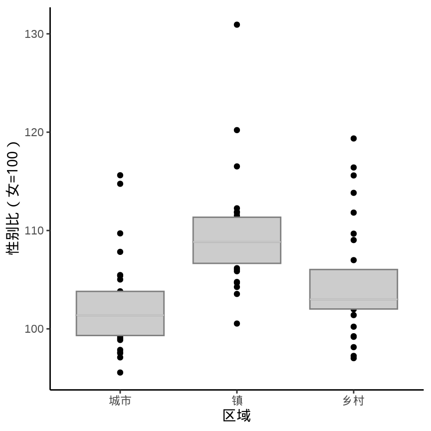
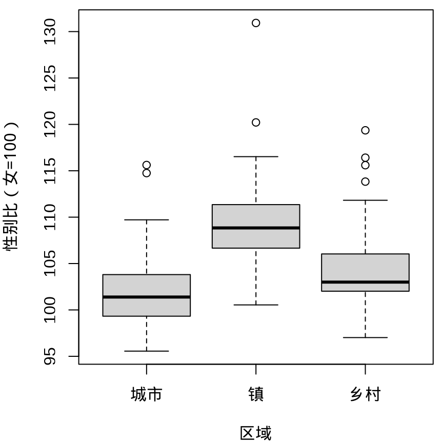
数据来自中国国家统计局发布的2021年统计年鉴,各省、直辖市和自治区分区域的性别比数据(部分)情况见 表格 8.1 。
8.1.1 箱线图
library(ggplot2)
ggplot(data = province_sex_ratio, aes(x = `区域`, y = `性别比(女=100)`)) +
  geom_boxplot() +
  theme_classic()

library(lvplot)
ggplot(data = province_sex_ratio, aes(x = `区域`, y = `性别比(女=100)`)) +
  geom_lv() +
  theme_classic()

boxplot(`性别比(女=100)` ~ `区域` , data = province_sex_ratio)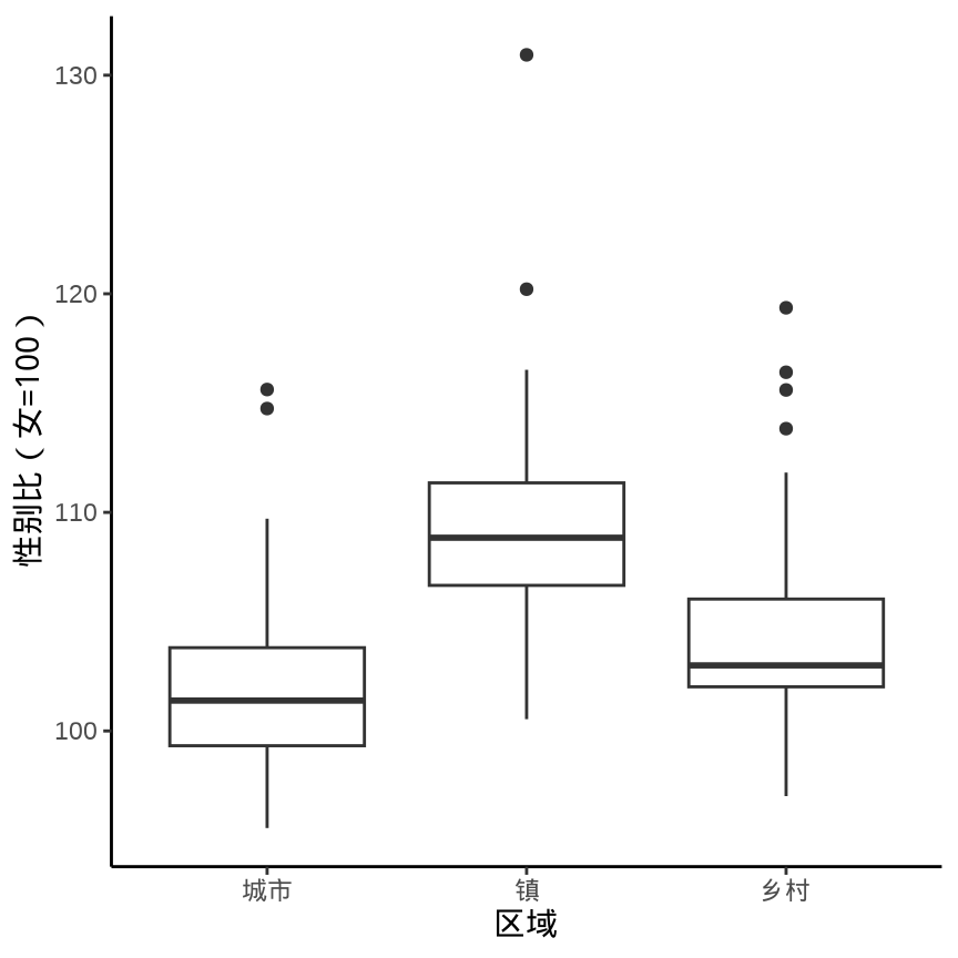
箱线图的历史有 50 多年了,它的变体也有很多。lvplot 包绘制箱线图的变体 (McGill 和 Larsen 1978)
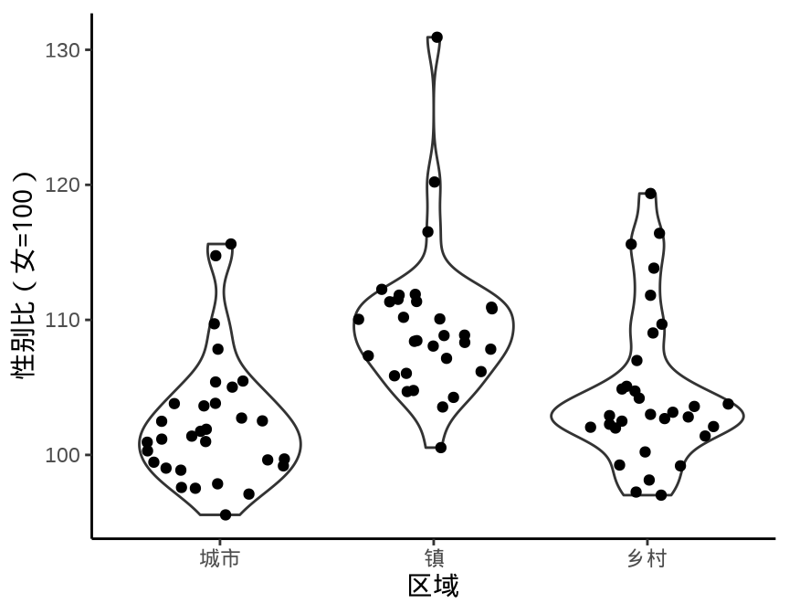
8.1.2 提琴图
ggplot(data = province_sex_ratio, aes(x = `区域`, y = `性别比(女=100)`)) +
  geom_violin(fill = "lightgray", draw_quantiles = c(0.25, 0.5, 0.75)) +
  theme_classic()

vioplot::vioplot(`性别比(女=100)` ~ `区域`,
  data = province_sex_ratio, col = "lightgray"
)

beanplot::beanplot(`性别比(女=100)` ~ `区域`,
  data = province_sex_ratio, col = "lightgray", log = "",
  xlab = "区域", ylab = "性别比(女=100)"
)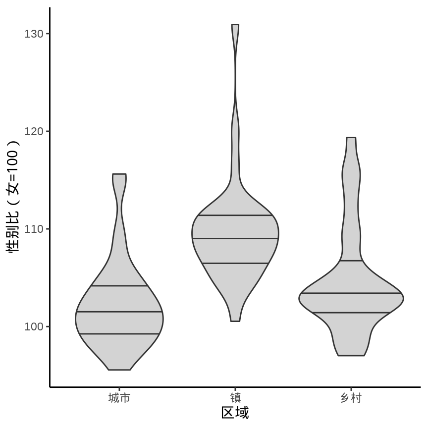
geom_violin()
beanplot 包的名字是根据图形的外观取的,bean 即是豌豆,rug 用须线表示数据。
8.1.3 直方图
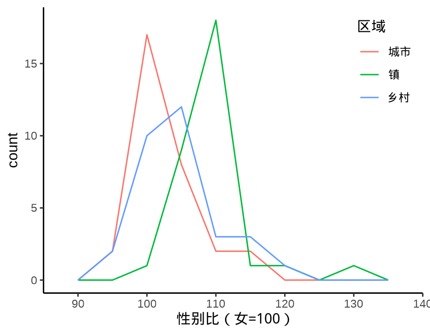
ggplot2 包绘制直方图的函数是 geom_histogram() ,而与之相关的函数 geom_freqpoly() 是绘制折线图,将直方图中每个柱子的顶点连接起来。
ggplot(data = province_sex_ratio, aes(x = `性别比(女=100)`, fill = `区域`)) +
  geom_histogram(binwidth = 5, color = "white", position = "stack") +
  theme_classic() +
  theme(legend.position = c(0.9, 0.8))

ggplot(data = province_sex_ratio, aes(x = `性别比(女=100)`, color = `区域`)) +
  geom_freqpoly(binwidth = 5, stat = "bin") +
  theme_classic() +
  theme(legend.position = c(0.9, 0.8))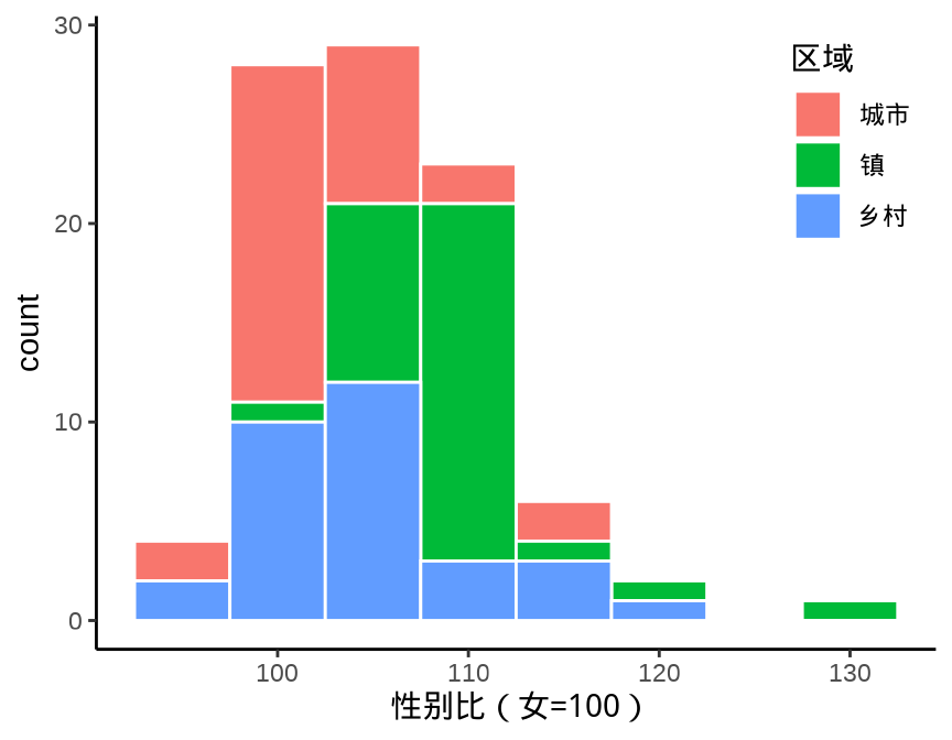
geom_histogram()
geom_freqpoly()
8.1.4 密度图
ggplot2 包绘制密度图的函数是 geom_density(), 图 8.4 展示分组密度曲线图
ggplot(data = province_sex_ratio, aes(x = `性别比(女=100)`)) +
  geom_density(aes(fill = `区域`), alpha = 0.5) +
  theme_classic()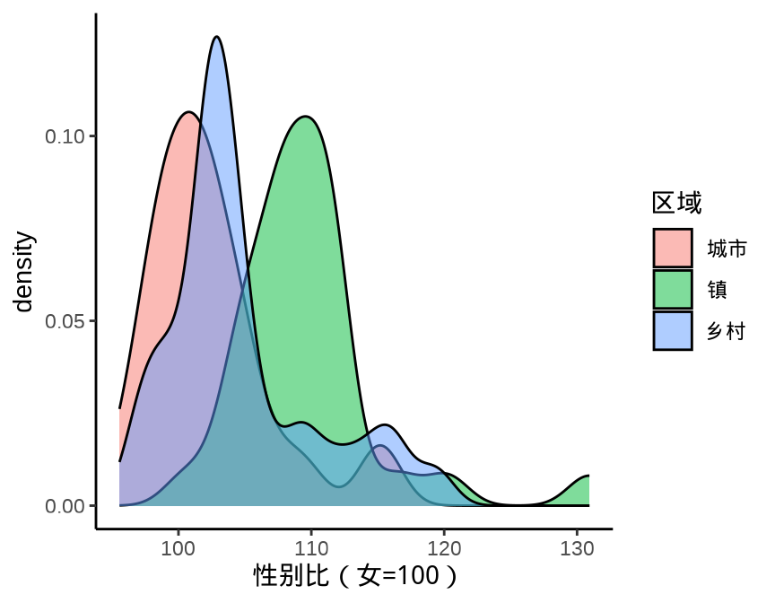
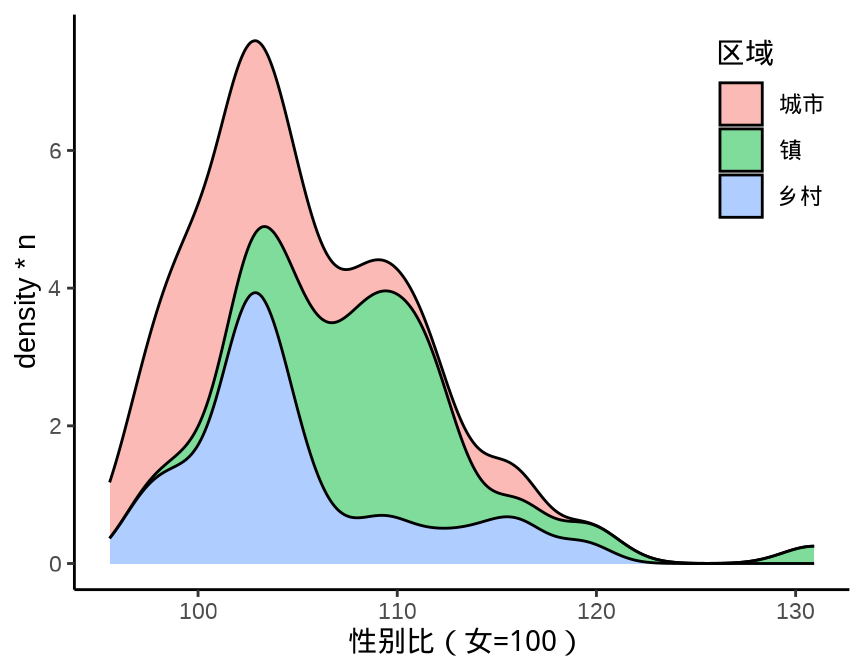
8.1.4.1 堆积(条件)密度图
注意
Stacked density plots: if you want to create a stacked density plot, you probably want to ‘count’ (density * n) variable instead of the default density
堆积密度图正确的绘制方式是保护边际密度。
ggplot(data = province_sex_ratio, aes(x = `性别比(女=100)`, y = after_stat(density))) +
  geom_density(aes(fill = `区域`), position = "stack", alpha = 0.5) +
  theme_classic() +
  theme(legend.position = c(0.9, 0.8))
ggplot(data = province_sex_ratio, aes(x = `性别比(女=100)`, y = after_stat(density * n))) +
  geom_density(aes(fill = `区域`), position = "stack", alpha = 0.5) +
  theme_classic() +
  theme(legend.position = c(0.9, 0.8))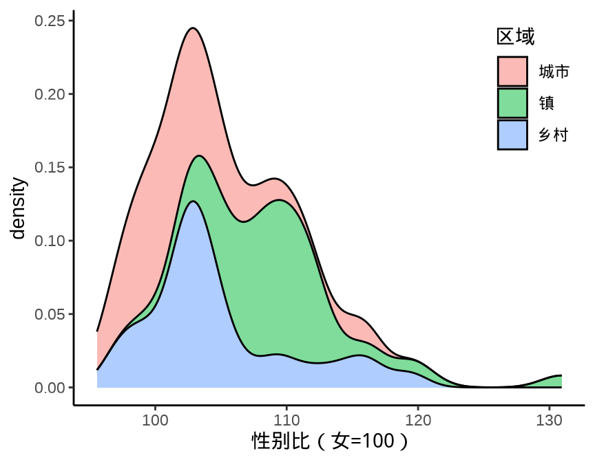
after_stat(density)
after_stat(density * n)
什么原因导致 图 8.5 中两个子图看起来没什么差别呢?而换一组数据,就可以看出明显的差别。
ggplot(diamonds, aes(x = carat, y = after_stat(density), fill = cut)) +
  geom_density(position = "stack") +
  theme_classic() +
  theme(legend.position = c(0.8, 0.8))
ggplot(diamonds, aes(x = carat, y = after_stat(density * n), fill = cut)) +
  geom_density(position = "stack") +
  scale_y_continuous(
    breaks = c(25000, 50000, 75000),
    labels = c("25K", "50K", "75K")) +
  theme_classic() +
  theme(legend.position = c(0.8, 0.8))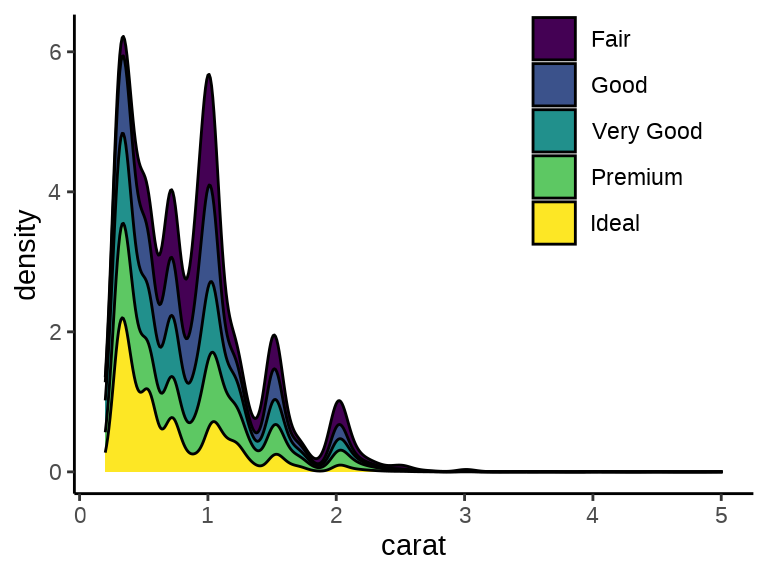
after_stat(density)
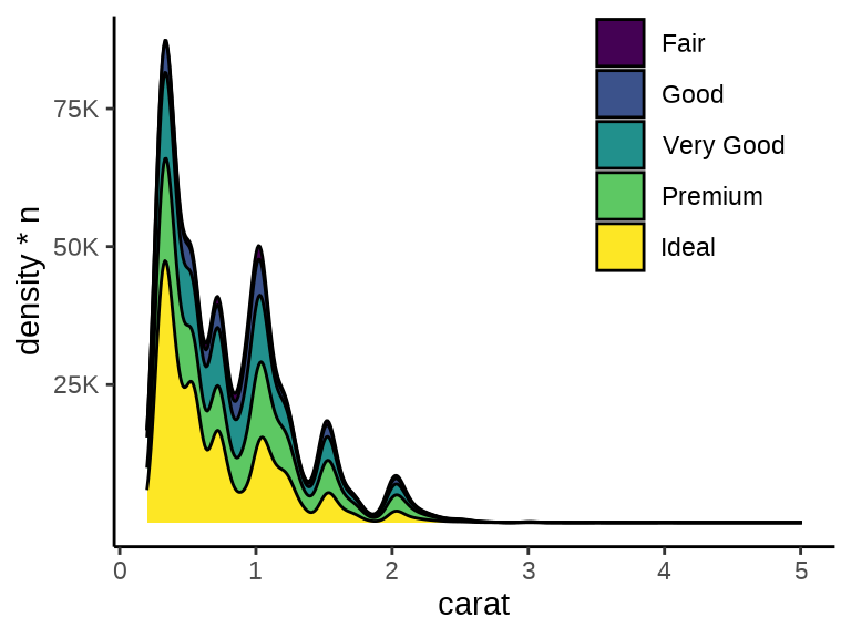
after_stat(density * n)
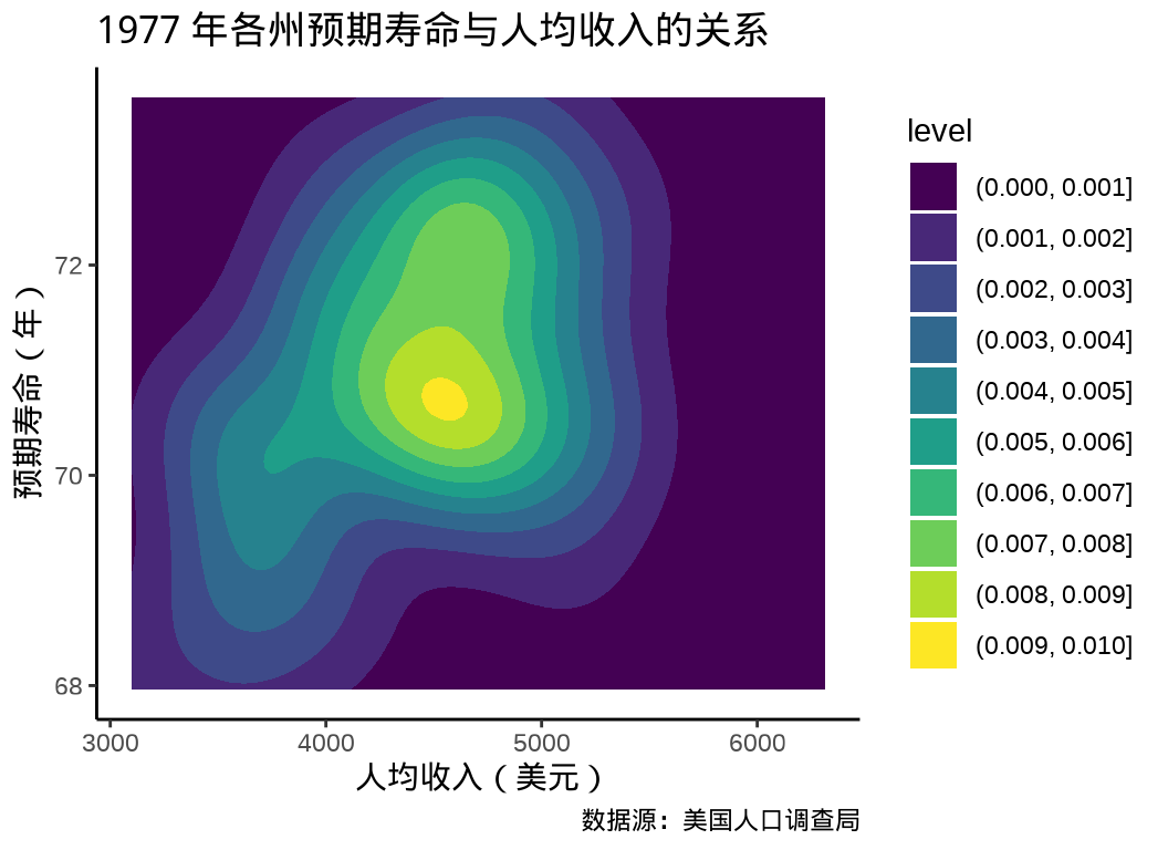
8.1.4.2 联合密度图
state_x77 <- data.frame(state.x77,
state_name = rownames(state.x77),
state_region = state.region,
check.names = FALSE
)
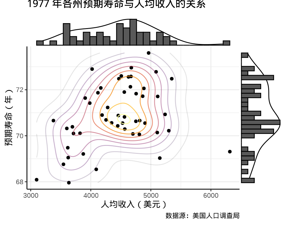
p1 <- ggplot(data = state_x77, aes(x = Income, y = `Life Exp`)) +
geom_point() +
geom_density_2d(aes(
color = after_stat(level),
alpha = after_stat(level)
), show.legend = F
) +
scale_color_viridis_c(option = "inferno") +
labs(
x = "人均收入(美元)", y = "预期寿命(年)",
title = "1977 年各州预期寿命与人均收入的关系",
caption = "数据源:美国人口调查局"
) +
theme_classic() +
theme(
panel.grid = element_line(colour = "gray92"),
panel.grid.major = element_line(linewidth = rel(1.0)),
panel.grid.minor = element_line(linewidth = rel(0.5))
)
p1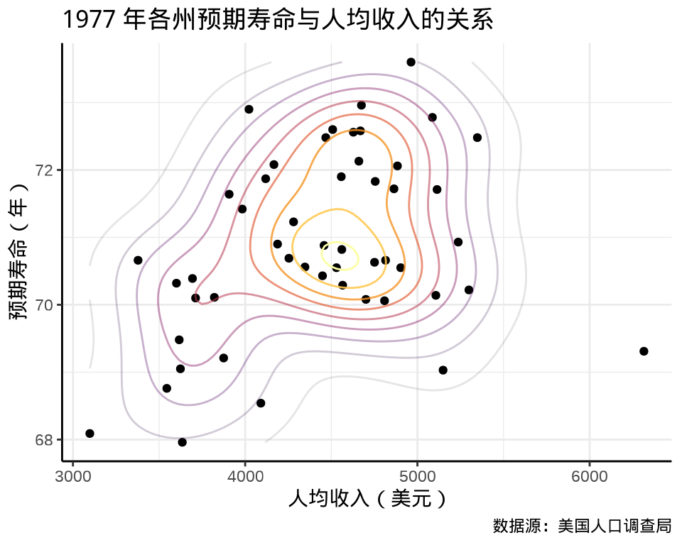
8.1.4.3 边际密度图
ggExtra 包(Attali 和 Baker 2022) 添加边际密度曲线和边际直方图。
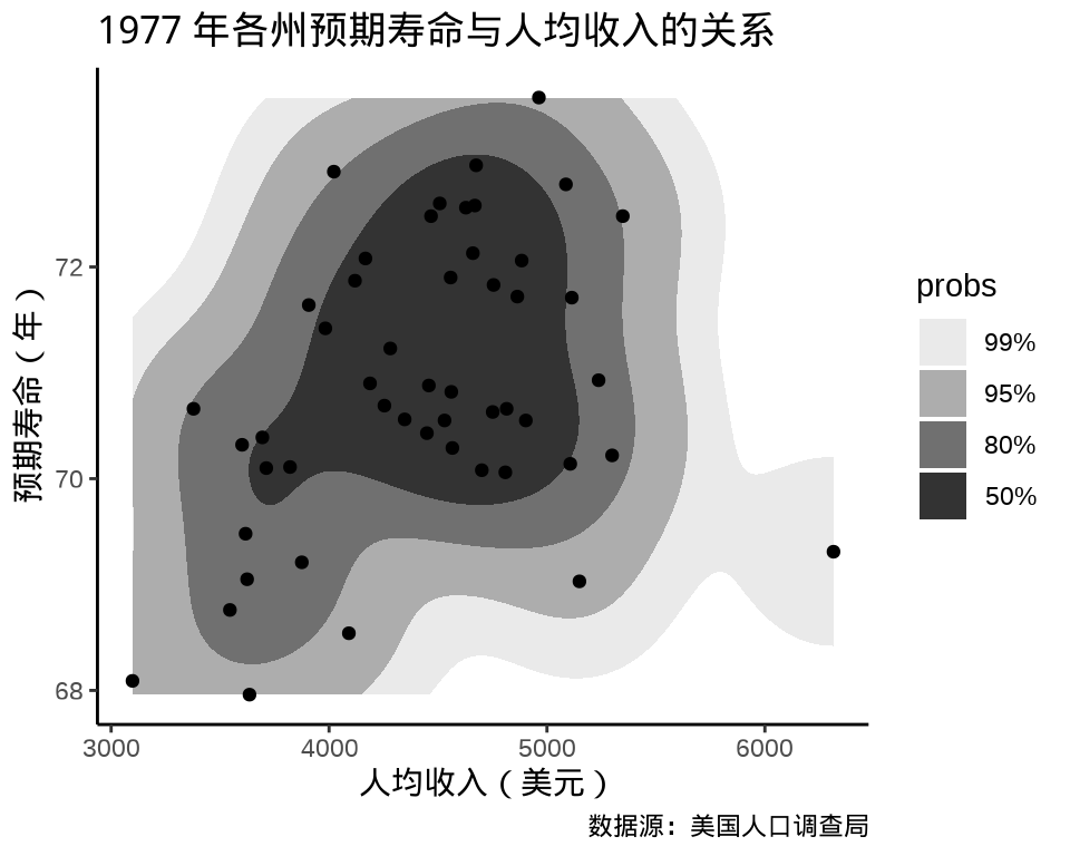
8.1.4.4 填充密度图
ggplot2 包提供二维密度图层 geom_density_2d_filled() 绘制热力图, ggdist (Kay 2022) 进行了一些扩展。
ggplot(data = state_x77, aes(x = Income, y = `Life Exp`)) +
  geom_density_2d_filled(contour_var = "count") +
  theme_classic() +
  labs(
    x = "人均收入(美元)", y = "预期寿命(年)",
    title = "1977 年各州预期寿命与人均收入的关系",
    caption = "数据源:美国人口调查局"
  )
相比于 ggplot2 内置的二维核密度估计,ggdensity (Otto 和 Kahle 2023) 有一些优势,根据数据密度将目标区域划分,更加突出层次和边界。gghdr 包与 ggdensity 类似,展示 highest density regions (HDR)
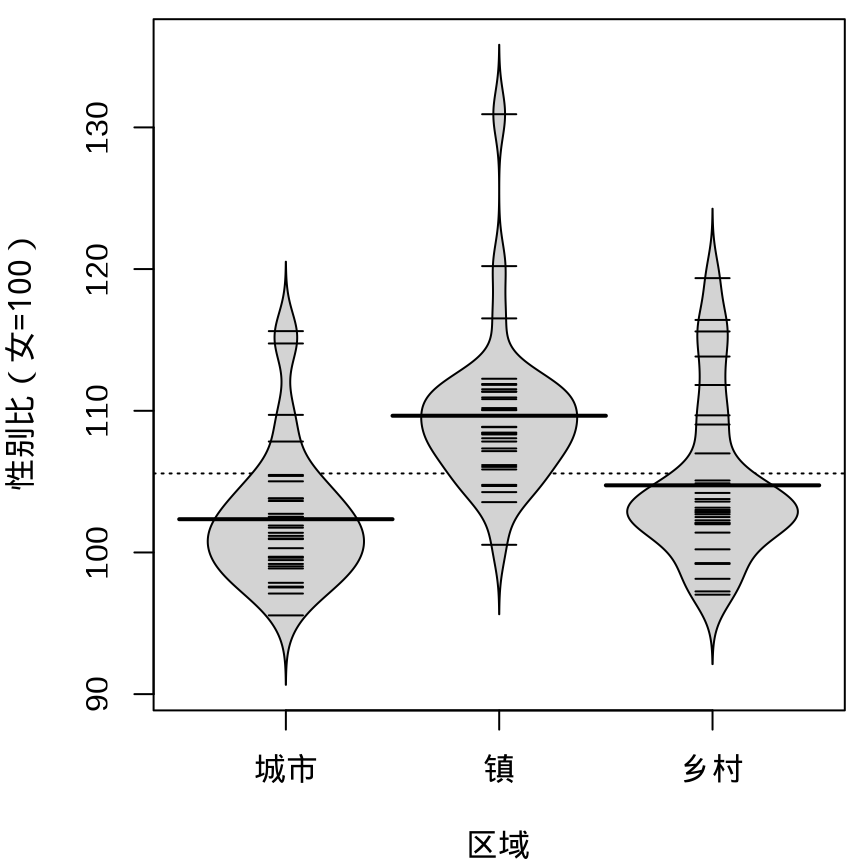
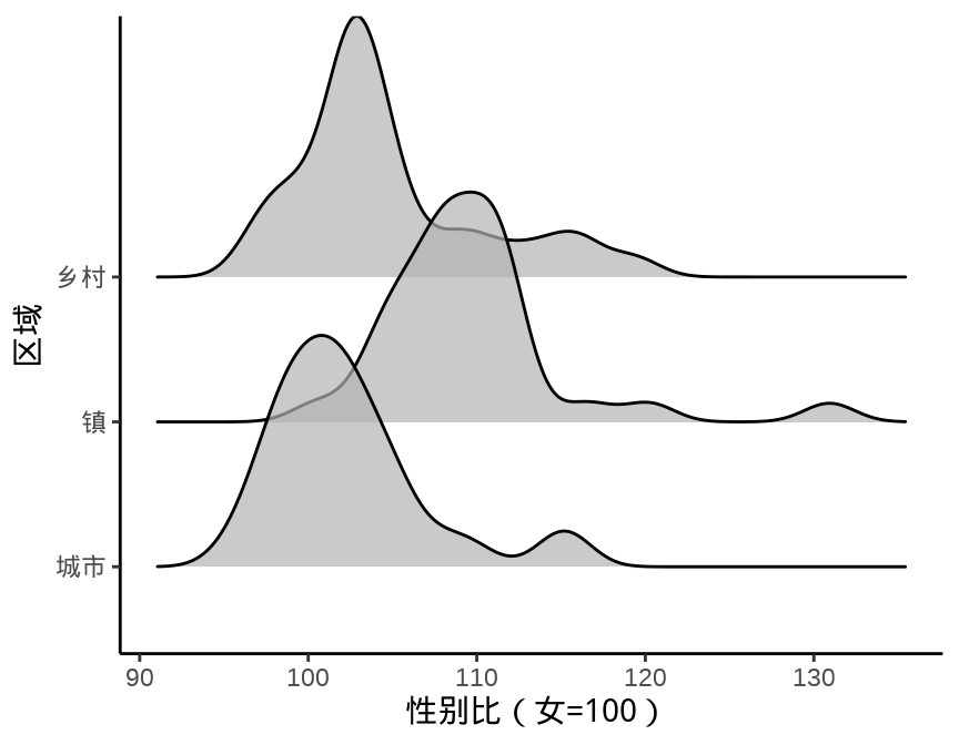
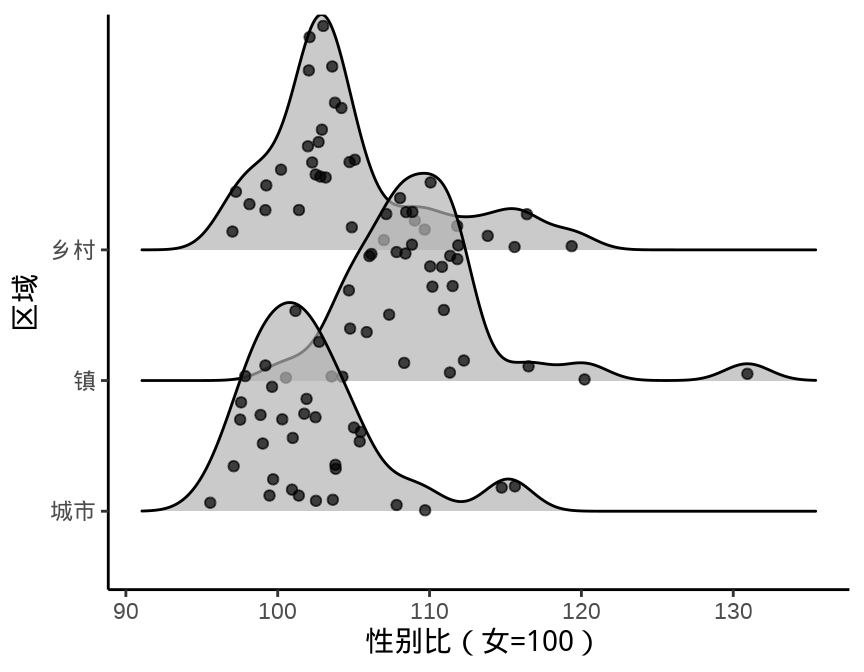
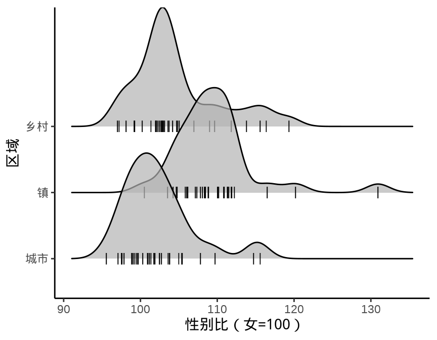
8.1.5 岭线图
叠嶂图,还有些其它名字,如峰峦图、岭线图等,详情参考统计之都主站《叠嶂图的前世今生》,主要用来描述数据的分布情况,在展示分布的对比上效果非常好。
图 8.11 设置窗宽为 1.5 个百分点
提示
除了中国国家统计年鉴,各省、自治区、直辖市及各级统计局每年都会发布一些统计年鉴、公告等数据,读者可以在此基础上继续收集更多数据,来分析诸多有意思的问题:
- 城市、镇和乡村男女性别比呈现差异化分布的成因。
- 城市、镇和乡村男女年龄构成。
- 将上述问题从省级下钻到市、县级来分析。
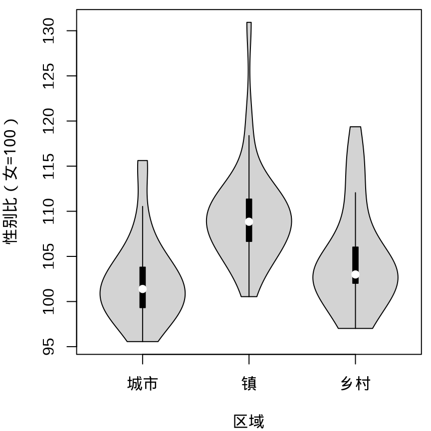
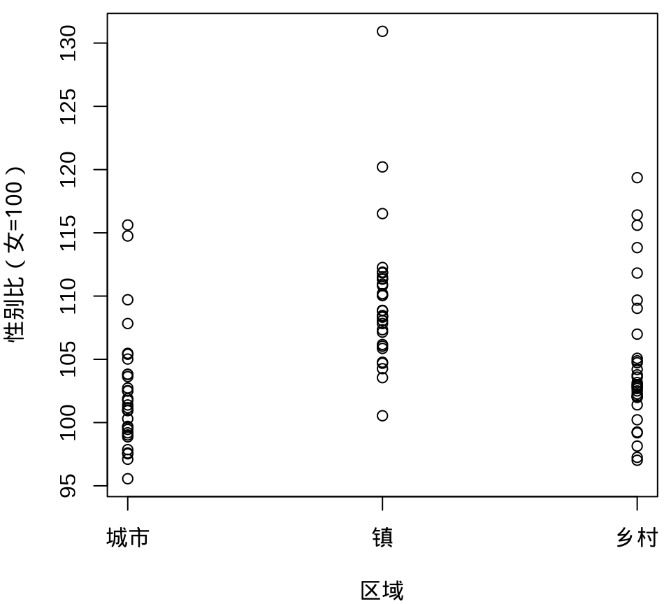
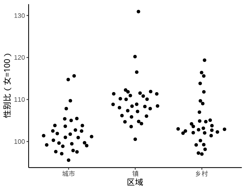
8.1.6 抖动图
下面先用函数 geom_point() 绘制散点图展示原始数据,通过点的疏密程度暗示数据的分布。Base R 函数 stripchart() 可以实现类似的效果。当数据量比较大时,点相互覆盖比较严重,此时,抖动图比较适合用来展示原始数据。
ggplot(data = province_sex_ratio, aes(x = `区域`, y = `性别比(女=100)`)) +
  geom_point() +
  theme_classic()

stripchart(
  `性别比(女=100)` ~ `区域`, vertical = TRUE, pch = 1,
  data = province_sex_ratio, xlab = "区域"
)

ggplot(data = province_sex_ratio, aes(x = `区域`, y = `性别比(女=100)`)) +
  geom_jitter(width = 0.25) +
  theme_classic()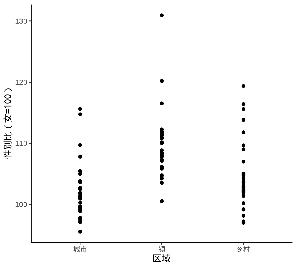
geom_point()
stripchart()
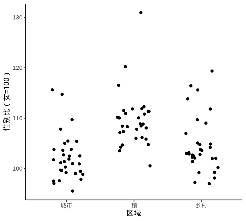
geom_jitter()
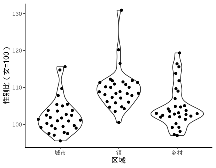
Sidiropoulos 等 (2018) 提出一种新的方式描述数据的分布,集合抖动图和小提琴图的功能,在给定的分布界限内抖动。数据点受 violin 的曲线限制,蜂群图也是某种形式的抖动图,添加 violin 作为参考边界,与 sina 图是非常类似的。
library(ggforce)
ggplot(data = province_sex_ratio, aes(x = `区域`, y = `性别比(女=100)`)) +
  geom_sina() +
  theme_classic()

ggplot(data = province_sex_ratio, aes(x = `区域`, y = `性别比(女=100)`)) +
  geom_violin() +
  geom_sina() +
  theme_classic()

library(ggbeeswarm)
ggplot(data = province_sex_ratio, aes(x = `区域`, y = `性别比(女=100)`)) +
  geom_quasirandom() +
  theme_classic()

ggplot(data = province_sex_ratio, aes(x = `区域`, y = `性别比(女=100)`)) +
  geom_violin() +
  geom_quasirandom() +
  theme_classic()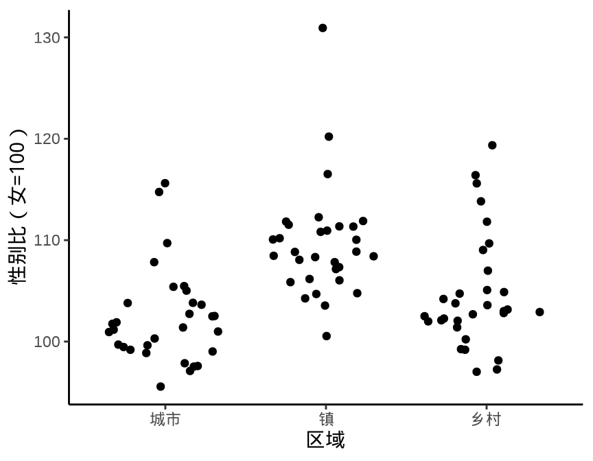
geom_sina()
geom_sina() 叠加函数 geom_violin()
geom_quasirandom()
geom_quasirandom() 叠加函数 geom_violin()
函数 geom_beeswarm() 提供了另一种散点的组织方式,按一定的规则,而不是近似随机的方式组织
8.2 描述关系
8.2.1 散点图
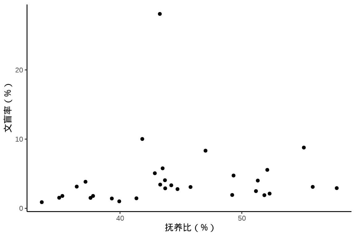
散点图用以描述变量之间的关系,展示原始的数据,点的形态、大小、颜色等都可以随更多变量变化。
中国国家统计局 2021 年发布的统计年鉴,2020 年 31 个省、直辖市、自治区的抚养比、文盲率、人口数的关系。
| 地区 | 人口数 | 15-64岁 | 抚养比 | 15岁及以上人口 | 文盲人口 | 文盲率 |
|---|---|---|---|---|---|---|
| 广东 | 126012510 | 91449628 | 37.79 | 102262628 | 1826344 | 1.79 |
| 山东 | 101527453 | 67100737 | 51.31 | 62464815 | 3308280 | 4.01 |
| 河南 | 99365519 | 62974661 | 57.79 | 76376565 | 2228594 | 2.92 |
| 江苏 | 84748016 | 58129537 | 45.79 | 71856068 | 2211291 | 3.08 |
| 四川 | 83674866 | 56036154 | 49.32 | 70203754 | 3330733 | 4.74 |
| 河北 | 74610235 | 49133330 | 51.85 | 59521267 | 1128423 | 1.90 |
其中,文盲人口是指15岁及以上不识字及识字很少人口,文盲率 = 文盲人口 / 15岁及以上人口,抚养比 = (0-14岁 + 65岁及以上) / 15-64岁人口数。
8.2.2 气泡图
气泡图在散点图的基础上,添加了散点大小的视觉维度,可以在图上多展示一列数据,下 图 8.15 新增了人口数变量。此外,在气泡旁边添加地区名称,将气泡填充的颜色也映射给了人口数变量。
library(ggrepel)
library(scales)
ggplot(
  data = china_raise_illiteracy,
  aes(x = `总抚养比`, y = `文盲人口占15岁及以上人口的比重`)
) +
  geom_point(aes(size = `人口数`, color = `人口数`),
    alpha = 0.85, pch = 16,
    show.legend = c(color = FALSE, size = TRUE)
  ) +
  scale_size(labels = label_number(scale_cut = cut_short_scale())) +
  scale_color_viridis_c(option = "C") +
  geom_text_repel(
    aes(label = `地区`),
    size = 3, max.overlaps = 50,
    segment.colour = "gray", seed = 2022, show.legend = FALSE
  ) +
  coord_cartesian(xlim = c(30, 60), ylim = c(0, 10.5), expand = FALSE) +
  theme_classic() +
  labs(x = "抚养比(%)", y = "文盲率(%)")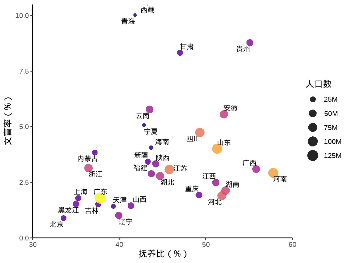
8.2.3 凹凸图
凹凸图描述位置排序关系随时间的变化,比如前年、去年和今年各省的 GDP 排序变化,春节各旅游景点的人流量变化。ggbump 包专门用来绘制凹凸图,如 图 8.16 所示,展示
library(ggbump)
# 位置排序变化
df <- data.frame(
  country = c(
    "印度", "印度", "印度", "瑞典",
    "瑞典", "瑞典", "德国", "德国",
    "德国", "芬兰", "芬兰", "芬兰"
  ),
  year = c(
    2018, 2019, 2020, 2018, 2019, 2020,
    2018, 2019, 2020, 2018, 2019, 2020
  ),
  value = c(
    492, 246, 246, 369, 123, 492,
    246, 369, 123, 123, 492, 369
  )
)

library(data.table)
df <- as.data.table(df)
df[, rank := rank(value, ties.method = "random"), by = "year"]

ggplot(df, aes(year, rank, color = country)) +
  geom_point(size = 7) +
  geom_text(data = df[df$year == min(df$year), ],
            aes(x = year - .1, label = country), size = 5, hjust = 1) +
  geom_text(data = df[df$year == max(df$year), ],
            aes(x = year + .1, label = country), size = 5, hjust = 0) +
  geom_bump(linewidth = 2, smooth = 8) +
  scale_x_continuous(limits = c(2017.6, 2020.4),
                     breaks = seq(2018, 2020, 1)) +
  theme_minimal(base_size = 14) +
  theme(legend.position = "none",
        panel.grid.major = element_blank()) +
  labs(x = NULL, y = "排名") +
  scale_y_reverse() +
  coord_fixed(ratio = 0.5)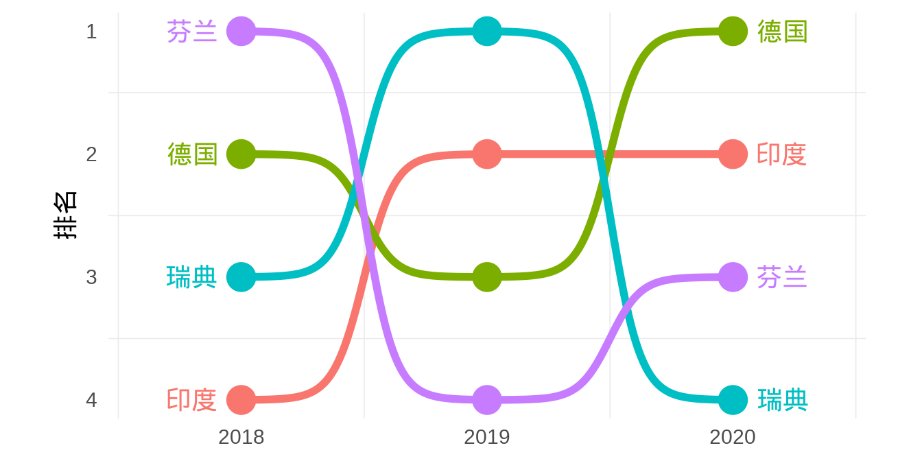
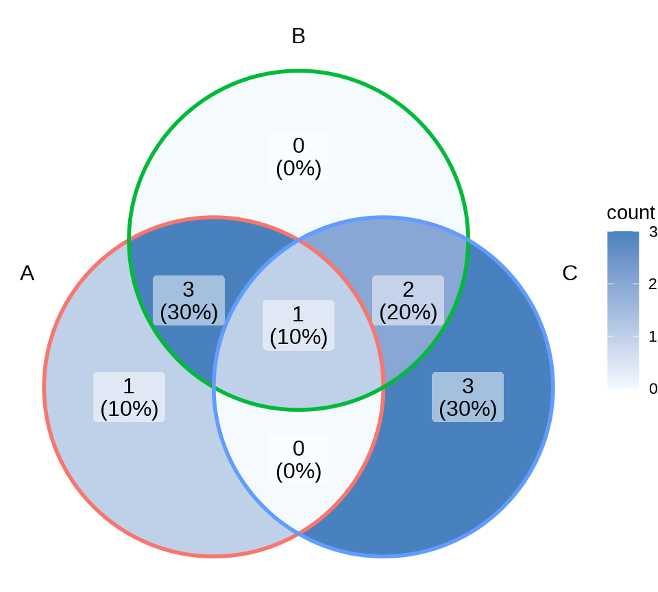
8.2.4 韦恩图
韦恩图描述集合、群体的交叉关系,整体和部分的包含关系,ggVennDiagram 包展示 A、B、C 三个集合的交叉关系,如 图 8.17 所示
8.2.5 网络图
tidygraph包 操作图数据,ggraph包描述网络图中节点重要性及依赖关系。
library(ggraph)
graph <- tidygraph::as_tbl_graph(highschool) |>
    dplyr::mutate(Popularity = tidygraph::centrality_degree(mode = 'in'))

graph
#> # A tbl_graph: 70 nodes and 506 edges
#> #
#> # A directed multigraph with 1 component
#> #
#> # A tibble: 70 × 2
#> name Popularity
#> <chr> <dbl>
#> 1 1 2
#> 2 2 0
#> 3 3 0
#> 4 4 4
#> 5 5 5
#> 6 6 2
#> # ℹ 64 more rows
#> #
#> # A tibble: 506 × 3
#> from to year
#> <int> <int> <dbl>
#> 1 1 13 1957
#> 2 1 14 1957
#> 3 1 20 1957
#> # ℹ 503 more rowsggraph(graph, layout = "kk") +
geom_edge_fan(aes(alpha = after_stat(index)), show.legend = FALSE) +
geom_node_point(aes(size = Popularity)) +
facet_edges(~year) +
theme_graph(
base_family = "sans",
foreground = "steelblue",
fg_text_colour = "white"
)#> Warning: Using the `size` aesthetic in this geom was deprecated in ggplot2 3.4.0.
#> ℹ Please use `linewidth` in the `default_aes` field and elsewhere instead.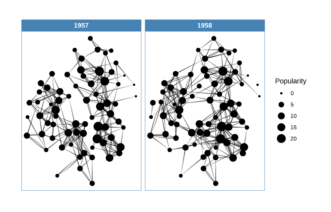
8.3 描述不确定性
统计是一门研究不确定性的学科,由不确定性引出许多的基本概念,比如用置信区间描述点估计的不确定性,用覆盖概率描述区间估计方法的优劣。下面以二项分布参数的点估计与区间估计为例,通过可视化图形介绍这一系列统计概念。就点估计来说,描述不确定性可以用标准差、置信区间。
- Michael Friendly 2021 年的课程 Psychology of Data Visualization
- Claus O. Wilke 2023 年的课程 SDS 375 Schedule Spring 2023
8.3.1 置信区间
| 0 | 1 | 2 | \(\cdots\) | n |
|---|---|---|---|---|
| \(p_0\) | \(p_1\) | \(p_2\) | \(\cdots\) | \(p_n\) |
二项分布 \(\mathrm{Binomial}(n,p)\) 的参数 \(p\) 的精确区间估计如下:
\[ \big(\mathrm{Beta}(\frac{\alpha}{2}; x, n-x+1), \mathrm{Beta}(1-\frac{\alpha}{2}; x+1, n-x)\big) \tag{8.1}\]
其中, \(x\) 表示成功次数,\(n\) 表示实验次数,\(\mathrm{Beta}(p;v,w)\) 表示形状参数为 \(v\) 和 \(w\) 的 Beta 贝塔分布的 \(p\) 分位数,参数 \(p\) 的置信区间的上下限 \(P_L,P_U\) 满足
\[ \begin{aligned} \frac{\Gamma(n+1)}{\Gamma(x)\Gamma(n-x+1)}\int_{0}^{P_L}t^{x-1}(1-t)^{n-x}\mathrm{dt} &= \frac{\alpha}{2} \\ \frac{\Gamma(n+1)}{\Gamma(x+1)\Gamma(n-x)}\int_{0}^{P_U}t^{x}(1-t)^{n-x-1}\mathrm{dt} &= 1-\frac{\alpha}{2} \end{aligned} \]
\(p_x\) 表示二项分布 \(\mathrm{Binomial}(n,p)\) 第 \(x\) 项的概率,\(x\) 的取值为 \(0,1,\cdots,n\)
\[p_x = \binom{n}{x}p^x(1-p)^{n-x}, \quad x = 0,1,\cdots,n\]
二项分布的累积分布函数和 \(S_k\) 表示前 \(k\) 项概率之和
\[S_k = \sum_{x=0}^{k} p_x\]
\(S_k\) 服从形状参数为 \(n-k,k+1\) 的贝塔分布 \(I_x(a,b)\),对应于 R 函数 pbeta(x,a,b)。 \(S_k\) 看作贝塔分布的随机变量 \(X\)
\[ \begin{aligned} B_x(a,b) &=\int_{0}^{x}t^{a-1}(1-t)^{b-1}\mathrm{dt} \\ I_x(a,b) &= \frac{B_x(a,b)}{B(a,b)}, \quad B(a,b) = B_1(a,b) \end{aligned} \]
考虑二项总体的参数 \(p=0.7\),重复模拟 50 次,每次模拟获得的比例 \(\hat{p}\) 及其置信区间,如 图 8.19 所示,置信区间覆盖真值的情况用不同颜色表示,覆盖用 TRUE 表示,没有覆盖用 FALSE 表示
library(ggplot2)
# Clopper and Pearson (1934)
# 与 binom.test() 计算结果一致
clopper_pearson <- function(p = 0.1, n = 10, nsim = 100) {
  set.seed(2022)
  nd <- rbinom(nsim, prob = p, size = n)
  ll <- qbeta(p = 0.05 / 2, shape1 = nd, shape2 = n - nd + 1)
  ul <- qbeta(p = 1 - 0.05 / 2, shape1 = nd + 1, shape2 = n - nd)
  data.frame(nd = nd, ll = ll, ul = ul, cover = ul > p & ll < p)
}
# 二项分布的参数 p = 0.7
dat <- clopper_pearson(p = 0.7, n = 10, nsim = 50)
# 二项分布的参数的置信区间覆盖真值的情况
ggplot(data = dat, aes(x = 1:50, y = nd / 10, colour = cover)) +
  geom_hline(yintercept = 0.7, lty = 2, linewidth = 1.2, color = "gray") +
  geom_pointrange(aes(ymin = ll, ymax = ul)) +
  theme_classic() +
  labs(x = "第几次模拟", y = "置信区间上下限", color = "覆盖")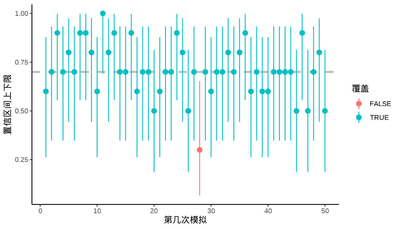
8.3.2 假设检验
假设检验的目的是做决策,决策是有风险的,是可能发生错误的,为了控制犯第一类错误的可能性,我们用 P 值描述检验统计假设的不确定性,用功效描述检验方法的优劣。对同一个统计假设,同一组数据,不同的检验方法有不同的 P 值,本质是检验方法的功效不同。
ggpval 在图上添加检验的 P 值结果,ggsignif (Constantin 和 Patil 2021) 在图上添加显著性注释。ggstatsplot (Patil 2021) 可视化统计检验、模型的结果,描述功效变化。ggpubr 制作出版级统计图形,两样本均值的比较。
with(
  aggregate(
    data = PlantGrowth, weight ~ group,
    FUN = function(x) c(dist_mean = mean(x), dist_sd = sd(x))
  ),
  cbind.data.frame(weight, group)
) |>
  ggplot(aes(x = group, y = dist_mean)) +
  geom_col(
    position = position_dodge(0.4), width = 0.4, fill = "gray"
  ) +
  geom_errorbar(aes(
    ymin = dist_mean - dist_sd,
    ymax = dist_mean + dist_sd
  ),
  position = position_dodge(0.4), width = 0.2
  ) +
  theme_classic() +
  labs(x = "组别", y = "植物干重")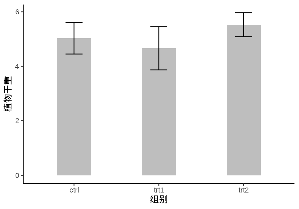
注释
R 3.5.0 以后,函数 aggregate() 的参数 drop 默认值为 TRUE, 表示扔掉未用来分组的变量,聚合返回的是一个矩阵类型的数据对象。
单因素方差分析 oneway.test() 检验各组的方差是否相等。
#>
#>  One-way analysis of means (not assuming equal variances)
#>
#> data:  weight and group
#> F = 5.181, num df = 2.000, denom df = 17.128, p-value = 0.01739
结果显示方差不全部相等,因此,采用函数 t.test(var.equal = FALSE) 来检验数据。图 8.21 展示假设检验的结果,分别标记了 ctrl 与 trt1、trt1 与 trt2 两组 t 检验的结果。
library(ggsignif)
ggplot(data = PlantGrowth, aes(x = group, y = weight)) +
  geom_boxplot(width = 0.25) +
  geom_jitter(width = 0.15) +
  geom_signif(comparisons = list(c("ctrl", "trt1"), c("trt1", "trt2")),
              map_signif_level = function(p) sprintf("p = %.2g", p),
              textsize = 6, test = "t.test") +
  theme_classic() +
  coord_cartesian(clip = "off")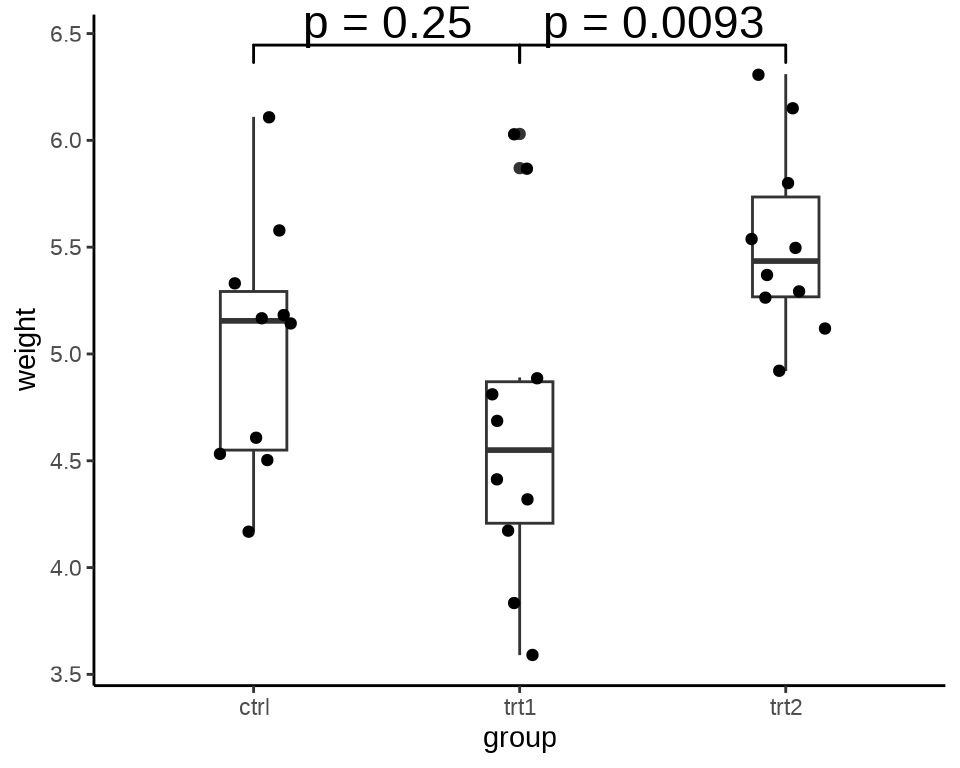
为了了解其中的原理,下面分别使用函数 t.test() 检验数据,结果给出的 P 值与上 图 8.21 完全一样。
#>
#>  Welch Two Sample t-test
#>
#> data:  weight by group
#> t = 1.1913, df = 16.524, p-value = 0.2504
#> alternative hypothesis: true difference in means between group ctrl and group trt1 is not equal to 0
#> 95 percent confidence interval:
#>  -0.2875162  1.0295162
#> sample estimates:
#> mean in group ctrl mean in group trt1
#> 5.032 4.661#>
#> Welch Two Sample t-test
#>
#> data: weight by group
#> t = -3.0101, df = 14.104, p-value = 0.009298
#> alternative hypothesis: true difference in means between group trt1 and group trt2 is not equal to 0
#> 95 percent confidence interval:
#> -1.4809144 -0.2490856
#> sample estimates:
#> mean in group trt1 mean in group trt2
#> 4.661 5.5268.3.3 模型预测
描述模型预测的不确定性,预测的方差、预测区间。线性回归来说,回归线及置信带。代码提交量的趋势拟合
svn_trunk_log <- readRDS(file = "data/svn-trunk-log-2022.rds")
svn_trunk_log$year <- as.integer(format(svn_trunk_log$stamp, "%Y"))
trunk_year <- aggregate(data = svn_trunk_log, revision ~ year, FUN = length)
ggplot(data = trunk_year, aes(x = year, y = revision)) +
  geom_point() +
  geom_smooth(aes(color = "LOESS", fill = "LOESS"),
    method = "loess", formula = "y~x",
    method.args = list(
      span = 0.75, degree = 2, family = "symmetric",
      control = loess.control(surface = "direct", iterations = 4)
    ), data = subset(trunk_year, year != c(1997, 2022))
  ) +
  geom_smooth(aes(color = "GAM", fill = "GAM"),
    formula = y ~ s(x, k = 12), method = "gam", se = TRUE,
    data = subset(trunk_year, year != c(1997, 2022))
  ) +
  geom_smooth(aes(color = "Cubic Spline", fill = "Cubic Spline"),
                method = "lm", formula = y ~ splines::bs(x, 3), se = T,
              data = subset(trunk_year, year != c(1997, 2022))) +
  scale_color_brewer(name = "模型", palette = "Set1") +
  scale_fill_brewer(name = "模型", palette = "Set1") +
  theme_classic() +
  theme(panel.grid.major.y = element_line(colour = "gray90")) +
  labs(x = "年份", y = "提交量")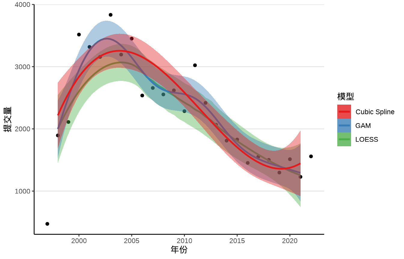
8.3.4 模型诊断
所有模型都是错误的,但有些是有用的。
— 乔治·博克斯
描述模型的敏感性,数据中存在的离群值,变量之间的多重共线性等。引入 Cook 距离、杠杆值、VIF 等来诊断模型。
# 准备数据
state_x77 <- data.frame(state.x77,
  state_name = rownames(state.x77),
  state_region = state.region,
  state_abb = state.abb,
  check.names = FALSE
)
# 线性模型拟合
fit <- lm(`Life Exp` ~ Income + Murder, data = state_x77)
# 模型诊断图
library(ggfortify)
autoplot(fit, which = 1:6, label.size = 3)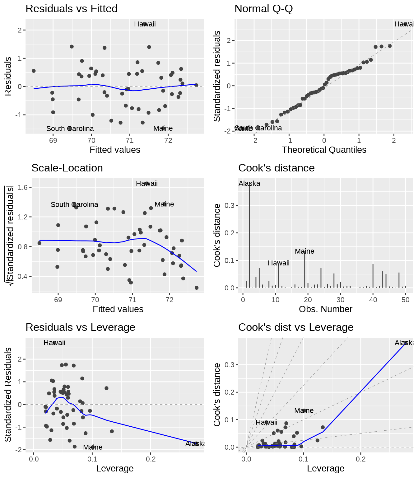
对于复杂的统计模型,比如混合效应模型的诊断,ggPMX 包。
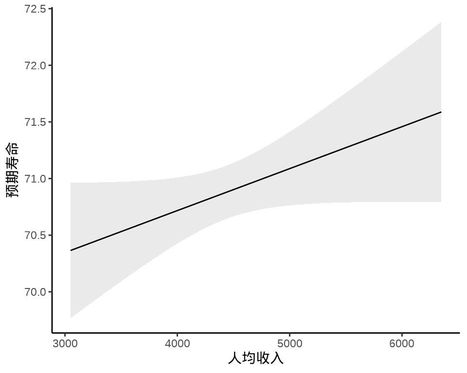
8.3.5 边际效应
继续 state_x77 数据集,以预期寿命(1969-1971 年统计)为因变量,Income 人均收入(1974 年)和 Murder 谋杀和非过失杀人率(单位:十万分之一,1976 年统计)为自变量,建立线性模型如下:
\[ \text{Life Exp} = \alpha + \beta_1 \text{Income} + \beta_2 \text{Murder} + \epsilon \tag{8.2}\]
在 R 语言中,可以用函数 lm() 拟合上述模型,
模型拟合结果输出如下:
#>
#> Call:
#> lm(formula = `Life Exp` ~ Income + Murder, data = state_x77)
#>
#> Residuals:
#>      Min       1Q   Median       3Q      Max
#> -1.48301 -0.62099 -0.01714  0.47768  2.20831
#>
#> Coefficients:
#>               Estimate Std. Error t value Pr(>|t|)
#> (Intercept) 71.2255815  0.9673952  73.626  < 2e-16 ***
#> Income       0.0003705  0.0001973   1.878   0.0666 .
#> Murder      -0.2697594  0.0328408  -8.214 1.22e-10 ***
#> ---
#> Signif. codes:  0 '***' 0.001 '**' 0.01 '*' 0.05 '.' 0.1 ' ' 1
#>
#> Residual standard error: 0.8259 on 47 degrees of freedom
#> Multiple R-squared:  0.637,  Adjusted R-squared:  0.6215
#> F-statistic: 41.23 on 2 and 47 DF,  p-value: 4.561e-11
ggeffects 描述单个自变量的作用,人均收入对预期寿命的边际效应